With the announcement of the 2020 Pantone Color of the Year just around the corner, we’re taking a look back at some of the most iconic COTY’s from the past 10 years, what they mean and what we can expect from the upcoming Color of the Year.
As December approaches, many begin preparing for Christmas and the celebratory period, whereas in the design world, the last month in the year means a special announcement that will influence colour and design choices for 2020: the Pantone Color of the Year.
In 2000, Pantone created the Color of the Year as a trendsetting concept for branding, marketing, and creative industries as a whole. When deciding on their Color of the Year, Pantone takes into account all aspects of society, such as fashion, marketing, social media, politics and most recently, the environment.
Here’s a look at the previous choices of Color of the Year for the last decade and the idea behind each shade.
2019: Living Coral 16-1546

An animating and life-affirming coral hue that represents environmental preservation, and the beauty we see in nature, such as coral reefs.
2018: Ultra Violet 18-3838
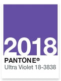
A dramatically provocative and thoughtful purple shade, Ultra Violet communicates originality, ingenuity and visionary thinking that points us toward the future.
2017: Greenery 15-0343

A refreshing shade, Greenery is symbolic of new beginnings and symbolises the innate craving to immerse ourselves in nature in this modern, technology-dominated world.
2016: Rose Quartz 13-1520 & Serenity 15-3919
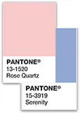
Blending two shades, the calming choice of colours represents consumers’ need for mindfulness and well-being as an antidote to modern-day stresses.
2015: Marsala 18-1438
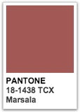
A naturally robust and earthy wine red, Marsala is a hearty yet stylish tone that is universally appealing and translates easily to fashion, beauty, home furnishings and interior.
2014: Radiant Orchid 18-3224
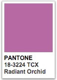
An expressive, creative and embracing purple; Radiant Orchid reaches across the colour wheel to intrigue the eye and spark the imagination, emanating great joy, love and health.
2013: Emerald 17-5641
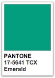
Emerald is a vivid green that enhances our sense of well-being further by inspiring insight as well as promoting balance and harmony.
2012: Tangerine Tango 17 – 1463
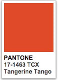
Reminiscent of the radiant shadings of a sunset, Tangerine Tango was chosen due to its spirited reddish orange, providing us with the energy boost we need to recharge and move forward.
2011: Honeysuckle 18-2120 18-2120
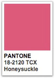
A dynamic reddish pink, Honeysuckle is an encouraging and uplifting shade, chosen for its captivating and stimulating effect that wards off the blues during stressful times.
2010: Turquoise 15-5519
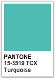
Combining the serene qualities of blue and the invigorating aspects of green, Pantone started off the decade with Turquoise, which inspires thoughts of soothing, tropical waters and a comforting escape from everyday troubles.
As we enter 2020, there has been speculation over whether the new colour will represent the current political climate, the new decade (revisiting the 20s), or even a fun and engaging colour to distract us from the difficult issues of modern life.
We’ll be making a few predictions of our own; what do you think the new Color of the Year will be?
NEW COLOURS, NEW POSSIBILITIES
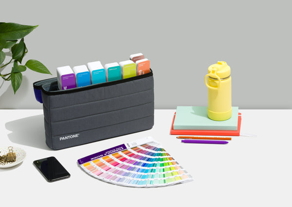
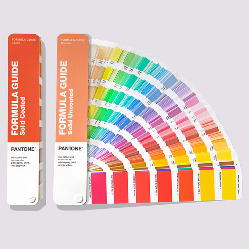
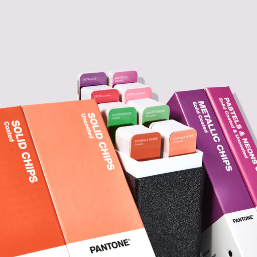
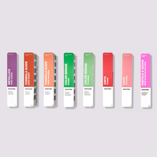
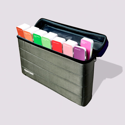
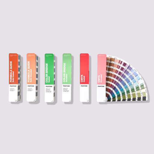
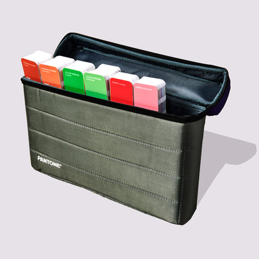
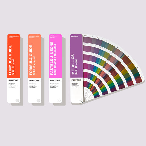
In September 2019, Pantone introduced 294 new colours to give designers a greater range of expression and freedom, and now with a total of 2,161 market-driven solid Pantone colours, extending your creative possibilities!