Colour is rarely seen in perfect conditions. A paint shade chosen in a showroom can look completely different once it is on the wall. A fabric sample can shift from warm to cool depending on the room. Packaging can appear one way under studio lighting and another entirely under retail lighting. The colour itself has not changed, but the light around it has.
This is one of the biggest challenges in design, interiors, branding and production, and understanding why it happens is the first step to managing it.
Light Is Part of Colour

It is easy to think of colour as fixed, but the way we see colour depends entirely on the light falling on it. Light sources vary in two important ways: colour temperature and quality.
Colour temperature is measured in Kelvin (K) and describes how warm or cool a light source appears. A traditional incandescent bulb sits around 2700K, producing a warm, amber-tinted light that brings out yellows, oranges and reds. A bright white LED office light might sit at 5000K or above, producing a cooler, bluer light that can make the same colour look sharper, greyer or more clinical. Daylight itself shifts throughout the day, warmer at sunrise and sunset, cooler and more neutral at midday.
The second factor is colour rendering quality, measured by the Colour Rendering Index (CRI). A light source with a high CRI (close to 100) reveals colours accurately, much as natural daylight does. A low-CRI source, as some fluorescent tubes and cheaper LEDs can be, may flatten or distort colours in ways that are difficult to predict. Two spaces lit to the same brightness can make the same colour look entirely different if their CRI values differ significantly.
That means a colour selected from a sample book, photograph or screen may not look the same in every environment. A soft neutral can appear cream under warm light, flat and lifeless under poor-quality lighting, or cooler and more architectural under bright white LEDs.
When the Same Colour Looks Like Two Different Colours

One of the more striking effects of variable lighting is a phenomenon called metamerism. This occurs when two colours appear to match under one light source but look noticeably different under another.
It happens because colours can be produced by different combinations of pigments or dyes, each of which absorbs and reflects light slightly differently. Under a particular light source, those differences are invisible. Change the light, and the mismatch becomes obvious. A paint finish that matches a fabric perfectly in the showroom might look quite different once both are in the room under evening light. A printed label that matches a product colour under studio conditions might drift under the fluorescent lights of a warehouse.
For designers, manufacturers and anyone involved in colour-critical production, metamerism is a real and practical problem. It is not a flaw in a single product but a consequence of how light and materials interact.
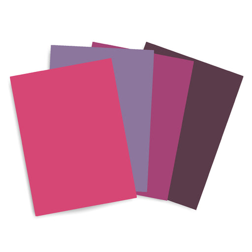
The Same Colour, Different Rooms
![]()

Beyond the physics of light sources, the built environment introduces its own variables. A north-facing room in the UK receives indirect, cooler daylight for most of the day. Colours chosen for that space will consistently lean cooler and slightly greyer than they might appear in a south-facing room that receives direct afternoon sunlight. Interior designers routinely advise testing paint colours at different times of day in the specific room, precisely because a colour that reads as a warm off-white at noon can feel distinctly cool and flat by late afternoon.
Retail environments add another layer of complexity. Commercial lighting is rarely chosen for neutrality; it is deliberately engineered to make products look appealing. Warm spotlighting in a clothing boutique flatters skin tones and makes fabric colours feel rich. Bright white lighting in a supermarket makes fresh produce look vivid. If a packaging designer approves a label colour under studio daylight, it may look subtly different under the LED downlighting of the shelf where it will actually be sold. These are not dramatic shifts, but in competitive retail environments, even subtle inconsistencies can undermine a brand's visual coherence.
The challenge extends to product photography, showrooms, trade fairs and any setting where a design is evaluated away from its final context.
Why Standardised Colour Systems Help

All of the above points to the same underlying problem. Colour as we see it in any given moment is unstable. It depends on conditions that change constantly, and that no single viewer can control.
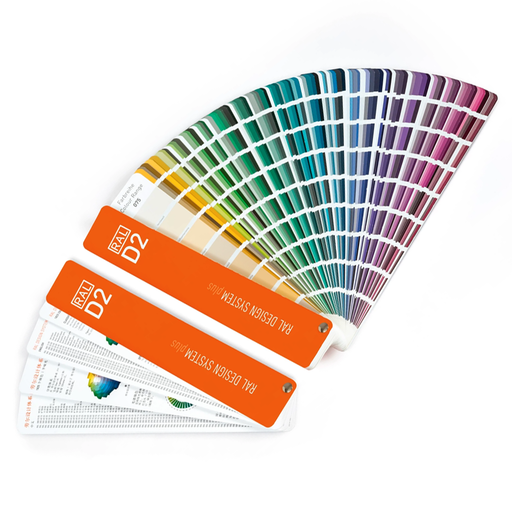
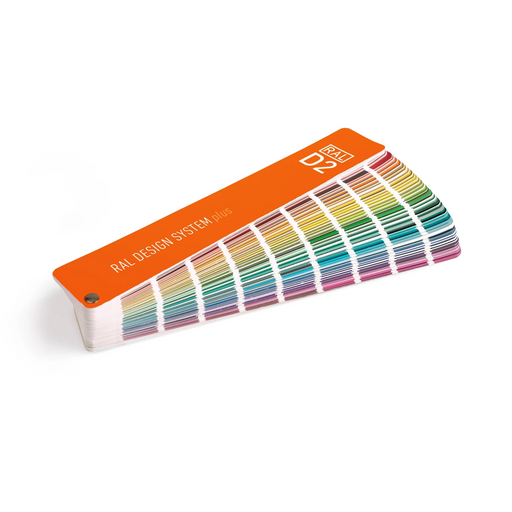
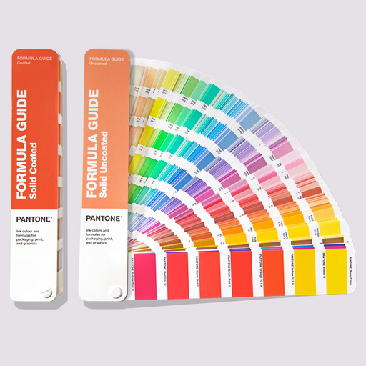
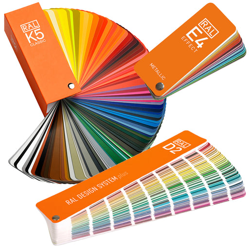
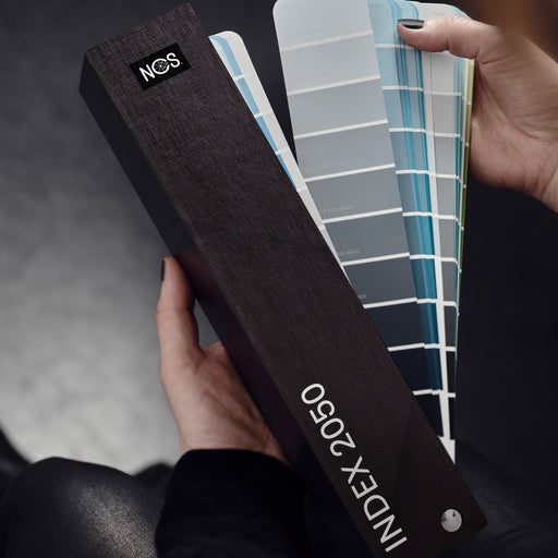
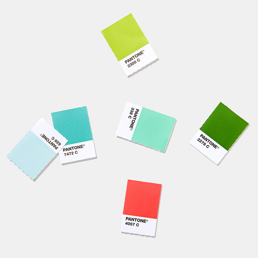
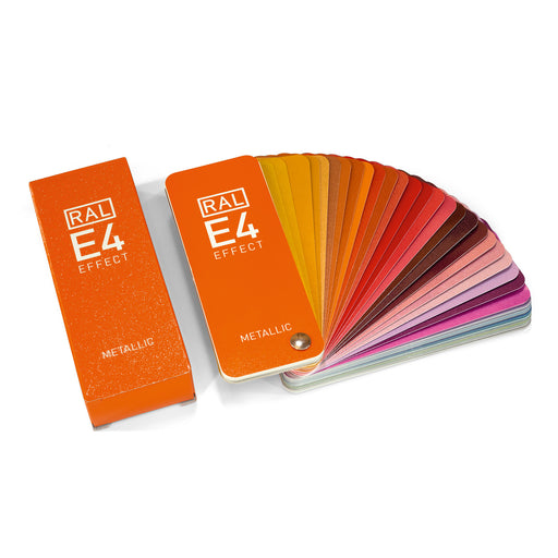
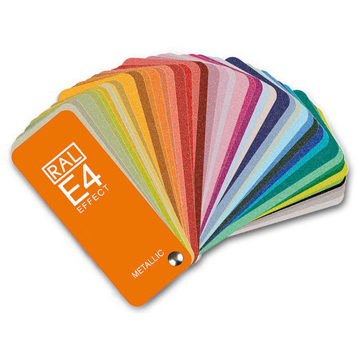
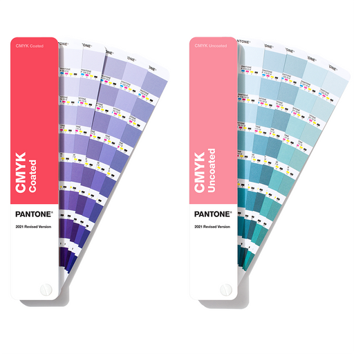
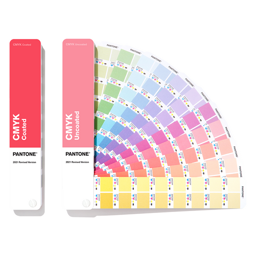
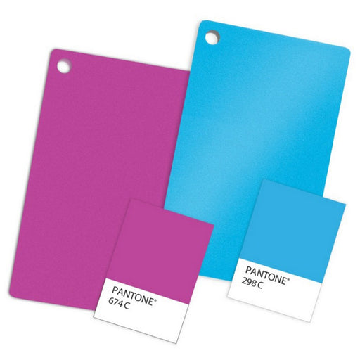
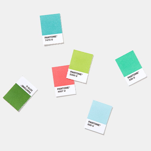
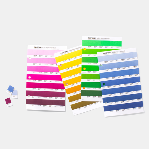
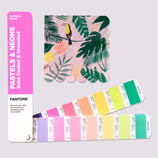
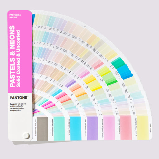
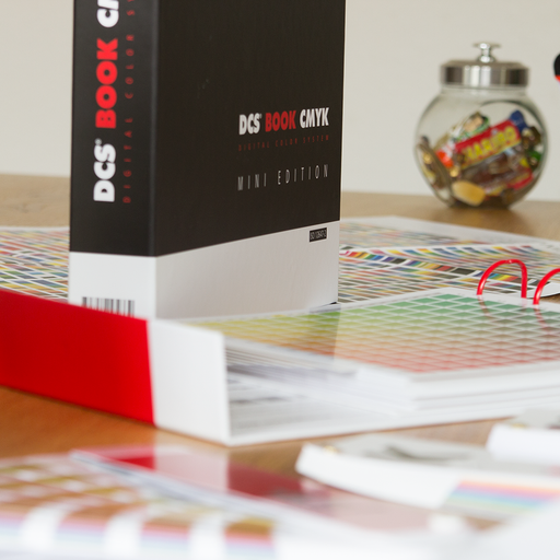
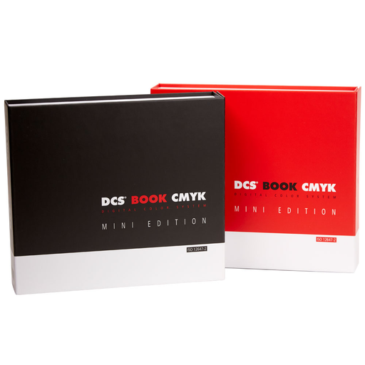
This is precisely why standardised colour systems exist. Physical references such as Pantone, RAL and NCS give designers, manufacturers, suppliers and clients a shared, stable point of reference that is independent of any particular lighting condition or screen.
Pantone is widely used in branding, print, packaging and product design. Rather than describing a colour as "warm grey" or "dusty blue", a Pantone reference identifies a specific, reproducible colour that a printer in one country can match to the same standard as a manufacturer in another.
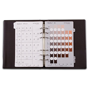
RAL is commonly used for architectural coatings, powder coatings, signage and industrial finishes, where consistency across large surfaces and long production runs matters most.
NCS, the Natural Colour System, is grounded in how humans actually perceive colour rather than in pigment mixing or printing processes. It is especially useful in architecture and interior design, where understanding how a colour will be experienced in a space is as important as specifying what it is.
None of these systems eliminates the effect of lighting entirely. A Pantone reference viewed under a 2700K bulb will still look different from the same reference viewed under daylight. But they create a fixed anchor point. When a colour needs to be approved, communicated across teams, or reproduced consistently at scale, a physical colour standard removes the ambiguity that lighting, screens and subjectivity would otherwise introduce.
Colour will always be affected by the conditions in which it is seen. Standardised references do not change that. What they do is give everyone involved in a project the same starting point, regardless of where they are or what the light is doing.