What Is a Colour Walk?
Creative inspiration does not always come from mood boards, trend reports or scrolling through saved images. Sometimes, it comes from stepping outside and paying closer attention to the colours already around you.
A colour walk is a simple creative exercise: choose a colour, theme or mood before you leave, then look for it as you walk. You might search for soft neutrals on your way to a café, bold reds through the city, earthy greens in a park, or metallic tones in an industrial area. The idea is not just to spot colour, but to notice it properly. A painted doorway, a tiled wall, a shop sign, a flowerbed, or a rusted railing can all become sources of inspiration when you are looking with intention.
For designers, makers, decorators and other creatives, a colour walk is a useful way to step away from the screen and gather ideas from real environments. It turns an ordinary route into a moving colour study.
Why Colour Walks Are Useful for Creatives
When you are working on a project, it is easy to return to the same sources of inspiration: Pinterest boards, past work, digital palettes or familiar references. These can be helpful, but they can also start to feel repetitive.
A colour walk gives you a different starting point. Instead of building a palette from a screen, you are drawing from the real world. You might notice how a faded green door sits against warm brick, how a pale yellow wall changes in the afternoon light, or how a flash of cobalt blue stands out against grey concrete.
These observations can feed directly into creative work. A walk through a garden might inspire a floral palette for packaging or textiles. A forest walk might suggest natural, earthy tones for interiors or branding. A city walk might reveal industrial greys, metallic finishes, signage colours and unexpected contrasts that could influence a product, campaign or visual identity.
It is also a good way to refresh your eye. Colour in real life is rarely flat or perfect. It is affected by light, texture, material, age and surroundings. Noticing these details can help you create palettes that feel more layered, considered and original.
Turning Observations into a Usable Palette
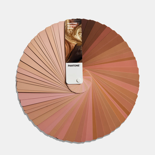
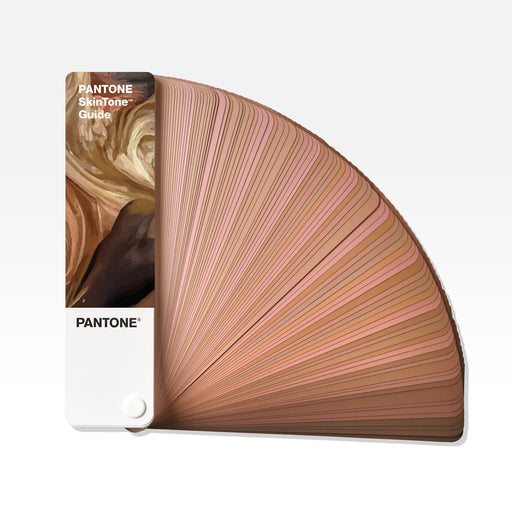
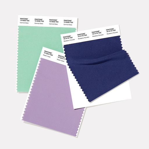
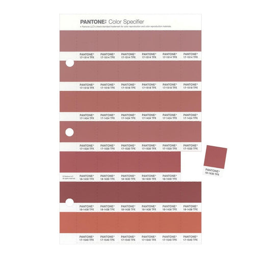
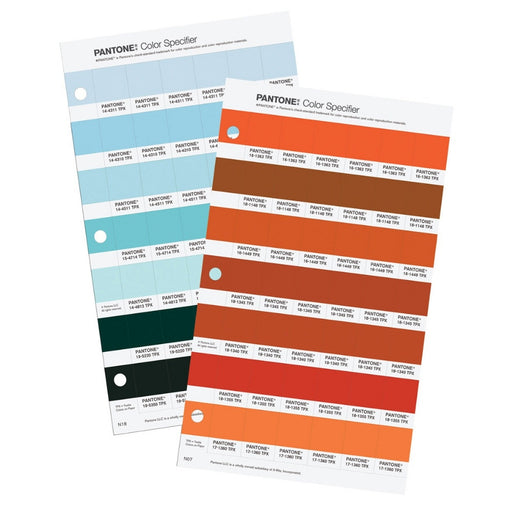
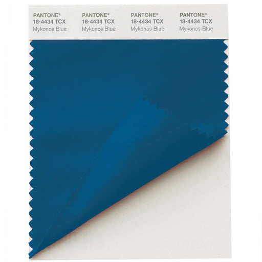
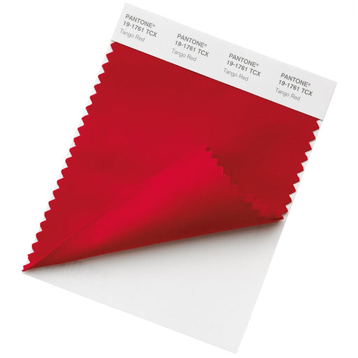
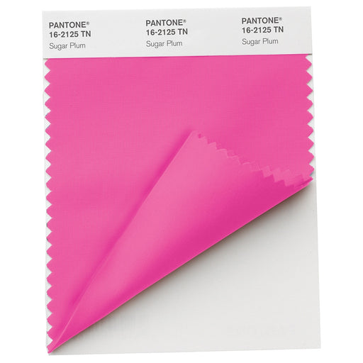
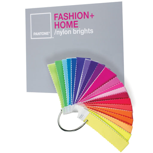
A colour walk is only as useful as what you bring back from it. For designers, that means taking a physical colour guide with you rather than relying on memory or photographs, both of which shift and distort colour in ways that make them unreliable references.
With a guide in hand, the walk becomes immediately more precise. Instead of noting "a nice muted green on a garden gate", you leave with a specific shade you can actually work with. Instead of a vague memory of warm, earthy tones from a woodland path, you have a set of references that can feed directly into a palette, a mood board or a client presentation.
This is also where the walk earns its value over screen-based inspiration. The colours you find and match in the real world, under natural light, in genuine context, carry a grounding that digitally sourced references often lack. They come from somewhere. That shows in the work.
Colour Walk Ideas for Different Projects
You can shape a colour walk around the kind of inspiration you need.
Different locations offer completely different colour languages, and matching the walk to the project is where the real value lies.
Floral, Botanical and Seasonal Work

If you are working on floral designs, textiles, packaging or seasonal visuals, try walking through a garden, park or flower market. Look for petal colours, leaf tones, soil, stems, shadows and natural combinations that already work beautifully together.
Natural and Earthy Palettes

For grounded, organic inspiration, head to a forest, woodland path or coastal route. Notice moss greens, bark browns, stone greys, sand tones, muted blues and the way colours soften in natural light.
Industrial, Architectural and Metallic

For a harder, more contemporary palette, walk through a city, business district or area with warehouses, bridges and older buildings. Look for concrete, steel, glass, painted shutters, weathered metal and the way light reflects off different surfaces.
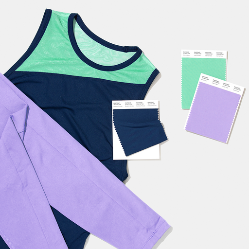
Branding and Retail
 For branding or retail inspiration, walk through high streets, markets or shopping areas. Pay attention to shopfronts, packaging, window displays, logos and the way colours compete or harmonise in busy visual spaces.
You can also choose a mood rather than a specific environment, then plan your walk around places that naturally reflect that feeling.
If you are looking for calm, try the seaside, a quiet park or a leafy residential street, where you might find muted sage, pale grey, soft blue, chalky white and weathered wood tones.

For nostalgia, look to places with a sense of memory or play, such as a fairground, playground, vintage market or old cinema, where faded yellows, dusty pinks, worn reds and softened pastels often appear.
For energy, head somewhere more urban: a city centre, skate park, market, sports court or busy high street, where saturated signage, bold graphics, concrete, graffiti and high-contrast colour combinations are easier to find.
In this version of a colour walk, the mood becomes your brief and the location becomes your source material. Instead of gathering colours that simply describe a place, you are collecting shades, contrasts and textures that help express a feeling.
A Simple Creative Reset
The best thing about a colour walk is that it changes how you see familiar places. A route you have taken hundreds of times can suddenly feel new, simply because you are looking with a different intention.
It is part creative prompt, part colour study and part mindfulness exercise. The focus is simple enough to feel relaxing, but specific enough to spark ideas. You are not forcing inspiration; you are giving yourself the chance to notice it.
For creative professionals, this can be especially valuable when a project feels stuck. A short walk can help you move away from overworked ideas and return with a fresh colour direction, a more interesting contrast, or a detail you would never have found from a screen.
A Small Way to See More
Colour walks are a simple way to bring more observation into your creative process. They help you slow down, look closer and collect inspiration from the world around you.
Choose a colour, a mood or a project theme before you head out. Take a colour guide if you want to match what you find more precisely. Then look for the details: doors, tiles, flowers, signs, shadows, packaging, reflections and textures.
You may discover that your everyday route has had a colour palette all along. You just needed to look at it differently.