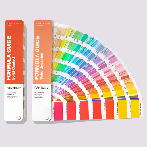
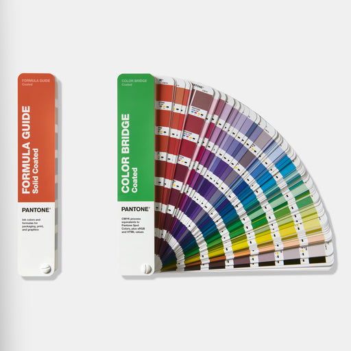
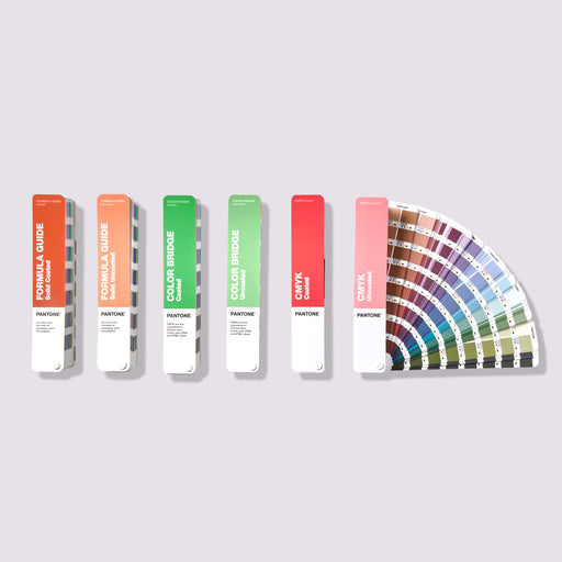
You’ve all heard of Pantone, and unless you’ve been living in an alternate designer universe, you’ve heard of the Pantone Formula Guide. But what about the Pantone Color Bridge? Whether you're getting started as a designer, managing a brand, directing creative projects or controlling colour across print and digital, this one’s for you. Let’s break down what it is and why it matters.
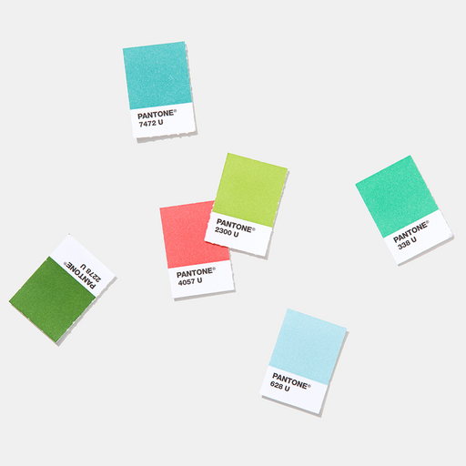
COMPARE SPOT VS CMYK COLOURS
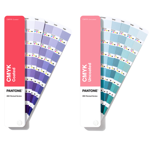
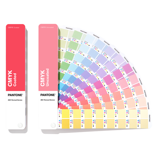
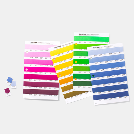
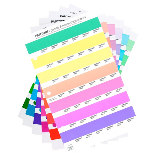
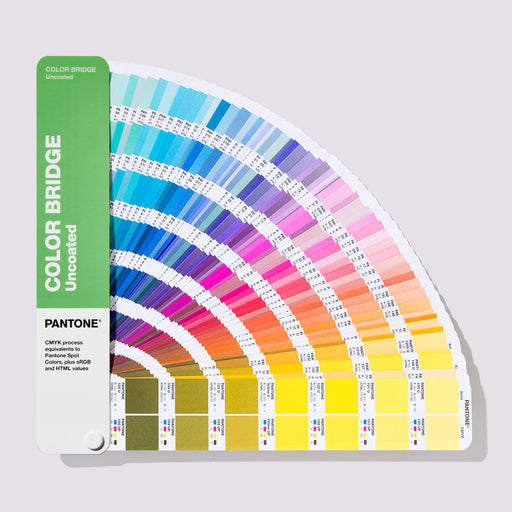
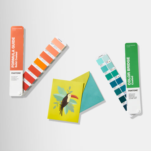
You may think - "If I already have a Formula Guide, why would I need a Color Bridge?" While Pantone’s Formula Guide is great for inspiring colour choices and verifying those colours, the Color Bridge (Coated & Uncoated) is Pantone’s most versatile colour tool yet – the Swiss Army knife for graphic design. It helps you see all the ways to replicate Pantone spot colours in other colour systems – CMYK, RGB and HTML, all on one line, i.e. saving you a lot of time and money in one guide!

Why do you need to compare spot and CMYK colours?
- CMYK has a smaller colour gamut and may produce colours that appear darker or flatter.
- Spot colours are pre-mixed using Pantone base inks, producing more precise and vibrant colours.
- You can’t replicate every spot colour in CMYK due to the limitations of the 4-colour process.
By using the Color Bridge, you can directly compare each Pantone spot colour with the closest CMYK match (based on G7/ISO standards), so you can decide when it is feasible to use budget-friendly process printing or when you will need to use a Pantone spot colour to get the desired results.
Having these cross-system values side-by-side allows you to:
- Picture how the colour could vary and appear across different applications – e.g. if you’re launching a new brand, you’ll want to ensure your logo colours are consistent on your website and your printed merchandise.
- Consider the colour result when using various printers, depending on the printing process.
- Ensure the colour positively impacts consumer behaviour and brand perception.
- Appear professional no matter where your brand or designs pop up.
So, at a time when companies and clients are more cost-conscious, and budgets are, of course, a hot topic, the Color Bridge can be indispensable.
ACCESS THE COLOUR VALUES YOU NEED FOR SCREEN AND WEB DESIGN
In today's digital age, achieving consistent colour representation across various platforms is essential, and as design trends continue to evolve, having a tool that bridges the gap between traditional print and digital media ensures your designs will remain relevant and impactful. Using the Color Bridge means you can transition your designs seamlessly from screen to print to web.
The Color Bridge includes:
- CMYK values for print design.
- RGB values for digital design.
- HTML/Hex values for web use.
It ensures colour consistency across:
- Websites
- Print materials
- Mobile apps
Using the Color Bridge gives you confidence that colours will appear consistently across everything your company or client does, from brochures and print ads to websites and apps and all that's in between. It allows you to consider the appearance of each colour anywhere and ensures your colours look great everywhere!
WHAT ABOUT SUSTAINABILITY?
Using the Color Bridge guides can reduce the need for physical proofs and reprints, producing less waste and encouraging more sustainable design practices. It’s a step forward towards greener design without compromising on quality.

EVERY LIGHT COUNTS – USE THE LIGHTING INDICATOR PAGE
Chances are, as a designer, you’ve fallen in love with a colour before, only to get to your desk and find that it looks nothing like you remember. Many factors affect how we perceive colour, but the most likely reason affecting what you see is the lighting.
There is a quick way to help the problem and get consistent colour, even if you don’t have a Light Booth handy. Color Bridge’s easy-to-use Lighting Indicator page indicates what part of your office, studio, or even when spotting inspiration outside, is the best setting for accurate colour evaluation. When the two patches match closely, you’re in good light for evaluation. If they look different, the lighting needs adjusting.
Get your Color Bridge Guide here and eliminate your colour woes!