A brand’s colour creates associations and expectations, triggering mental images and memories in the consumer’s mind. Some brands are so iconic, that it’s possible to identify them from just a single Pantone colour, without the associated logo. Others have even gone so far as to trademark their defining shades.
In product development, the right colour is the differentiating factor that can stop someone in their tracks and capture their attention. It is also the most important design element for reflecting mood and style.
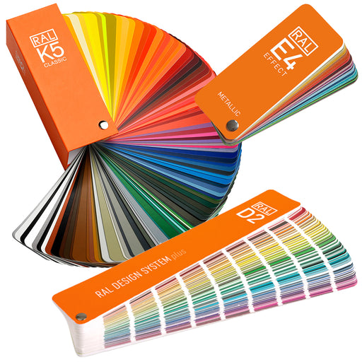
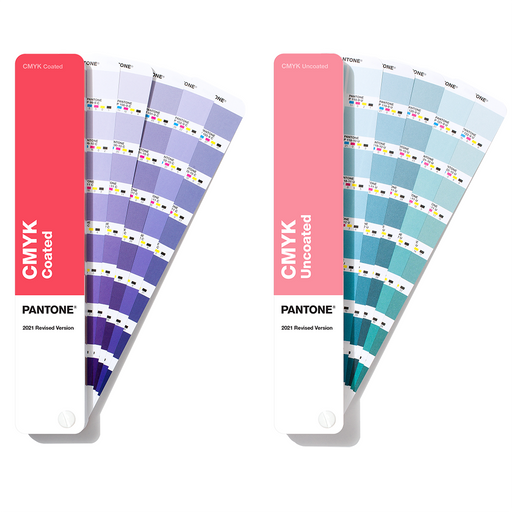
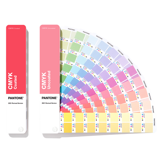
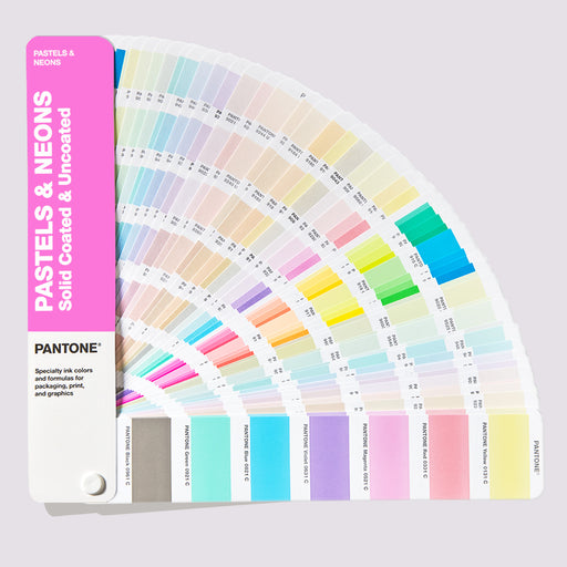
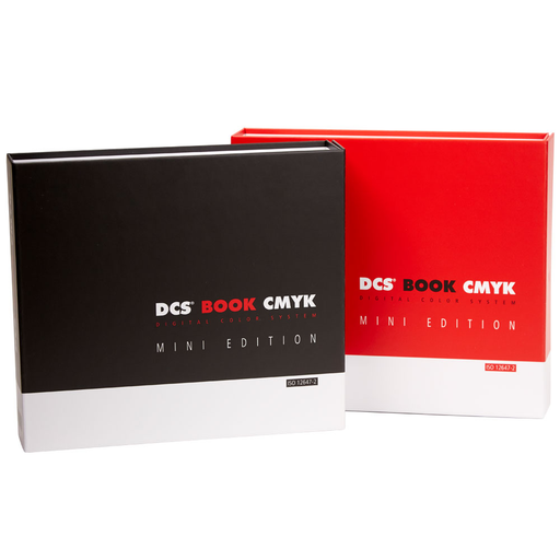
But, choosing the right colour is only the beginning. Keeping that colour consistent presents multiple challenges that can be solved through Pantone Colour Systems.
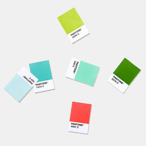
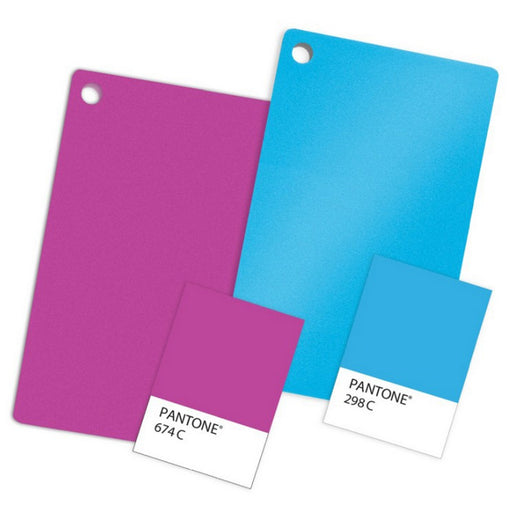
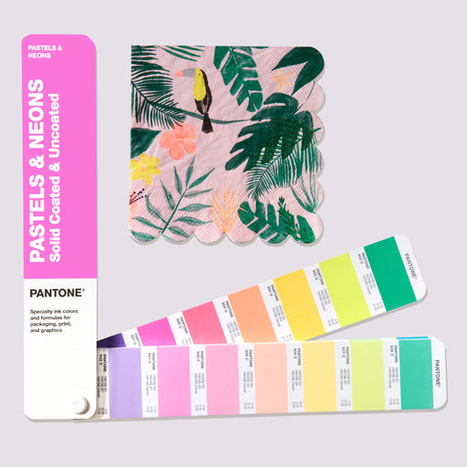
Colour Interpretation: We all interpret colour in slightly different ways. Even something as seemingly specific as Navy Blue can mean different things to different people. Using a Pantone Colour enables you to communicate your precise colour requirements in a language that is recognised around the world.
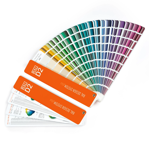
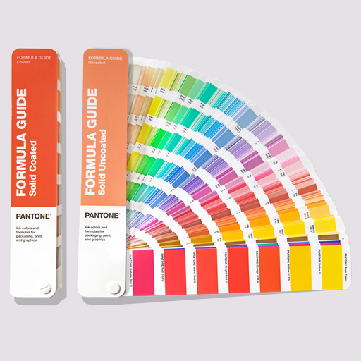
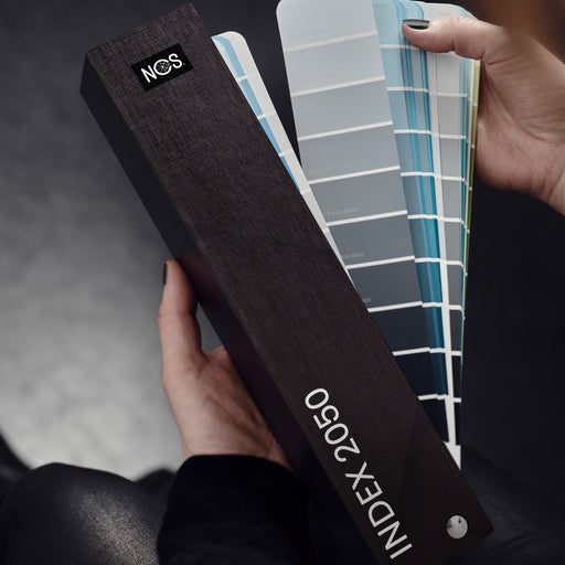
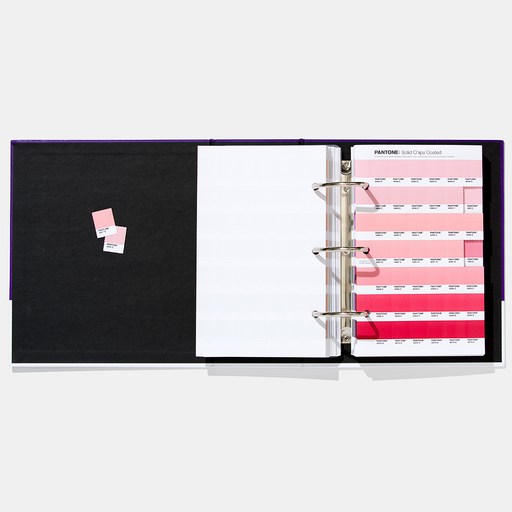
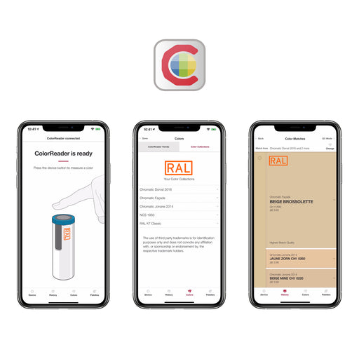
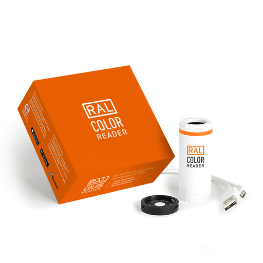
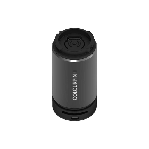
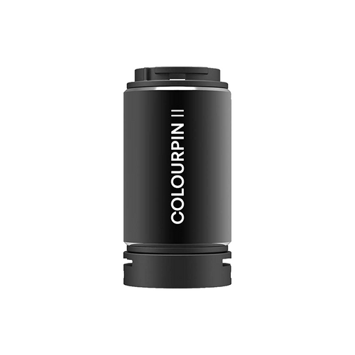
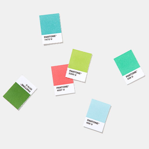
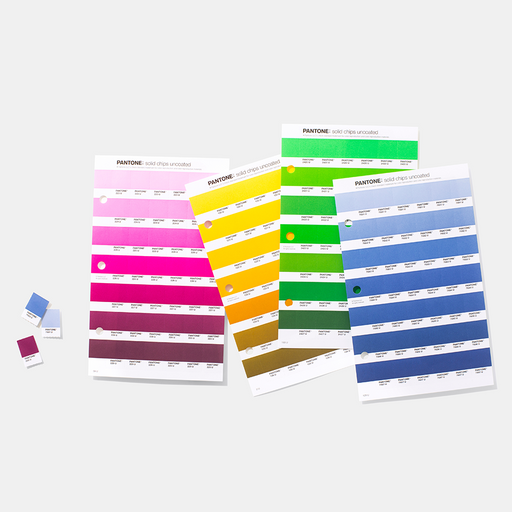
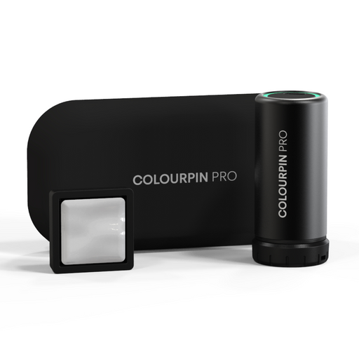
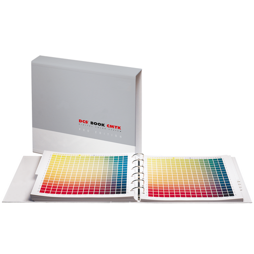
Multiple Materials: The colour of your final production material can have a massive impact on the appearance of your product. Pantone’s digital tools, like Pantone Connect, and physical colour references, like Pantone fan guides and chip books, allow you to preview and adjust these results before production, helping you to avoid additional time and expense.
Multiple Suppliers: Working with more than one supplier can mean variations in processes and equipment, leading to results that can vary significantly. Pantone’s cloud-based colour tools can ensure that your suppliers are all aiming toward the same target, for consistent results across the board.
Multiple Production Runs: Your colour may be consistent throughout a production run, but will it match the run before it? Or the one that follows? Colour measurement and evaluation tools from Pantone and parent company, X-Rite, make it possible to achieve consistent colour from run to run, no matter when or where it is produced.
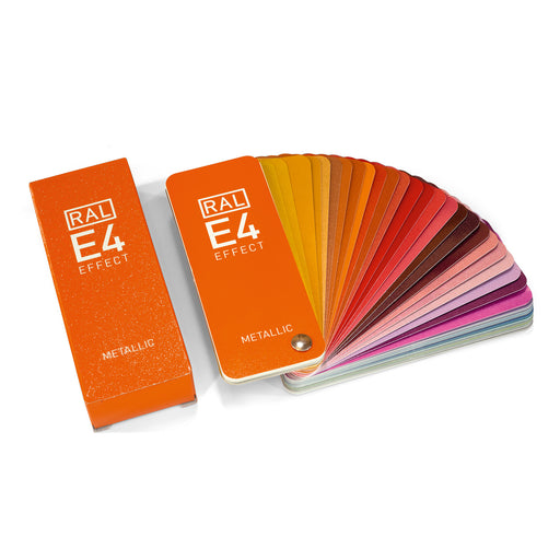
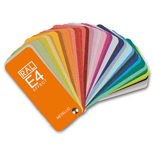
Make sure you’re up to date with the latest Pantone Colour Systems to keep your brand colours consistent. Our Pantone fan guides ensure you’re speaking the same language across multiple suppliers with no time wasted on identifying the precise shade for your brand.
What Is a Colour Walk? Creative inspiration does not always come from mood boards, trend reports or scrolling through saved images. Sometimes, it comes from stepping outside and paying closer attention to the colours already around you. A colour walk...
Colour is rarely seen in perfect conditions. A paint shade chosen in a showroom can look completely different once it is on the wall. A fabric sample can shift from warm to cool depending on the room. Packaging can appear...
The difference between a good monitor and the right monitor shows up in the work. The EIZO ColorEdge CG2700X is a 27-inch colour management monitor built for professionals who can't afford to get colour wrong; photographers who need every skin tone...