Contact Us
0800 977 4167
0800 977 4167


Pair large text with an image to give focus to your chosen product, collection, or blog post. Add details on availability, style, or even provide a review.

Sometimes you unexpectedly find the perfect colour during your day-to-day life. PANTONE Capsure device can help you accurately measure and save colours that inspire you.

While we all know that spot colour printing is the most accurate, it is also the most expensive. Therefore, PANTONE’s developed one guide for process printing that helps you achieve the closest match to PMS when budgets are tight: the Color Bridge Guide.
This fan guide provides a side-by-side visual comparison of PANTONE Spot Colours to their closest CMYK process printing match. Color Bridge is the only guide that includes CMYK, Hex, and RGB values for each PMS colour.
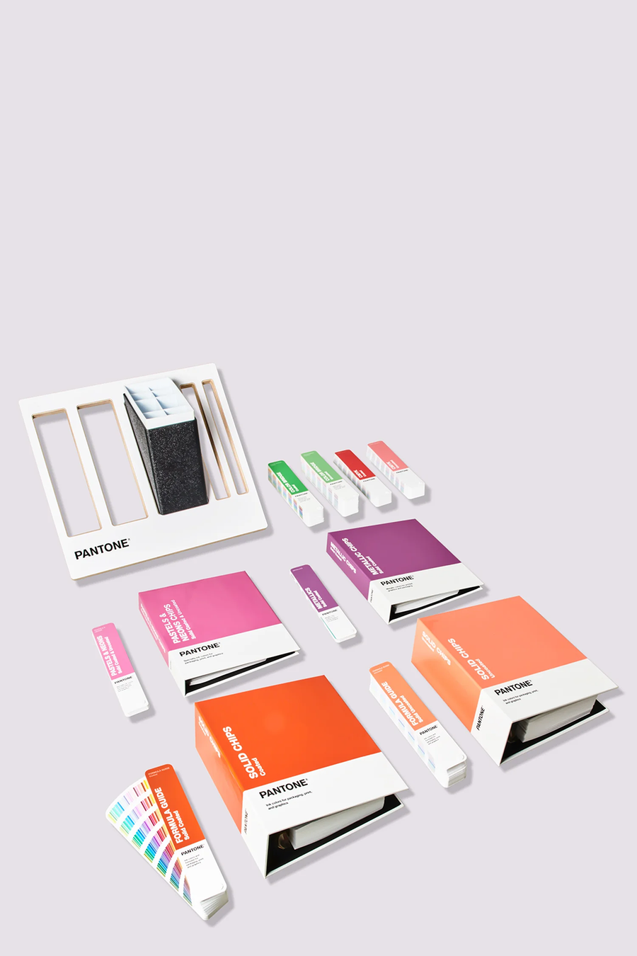
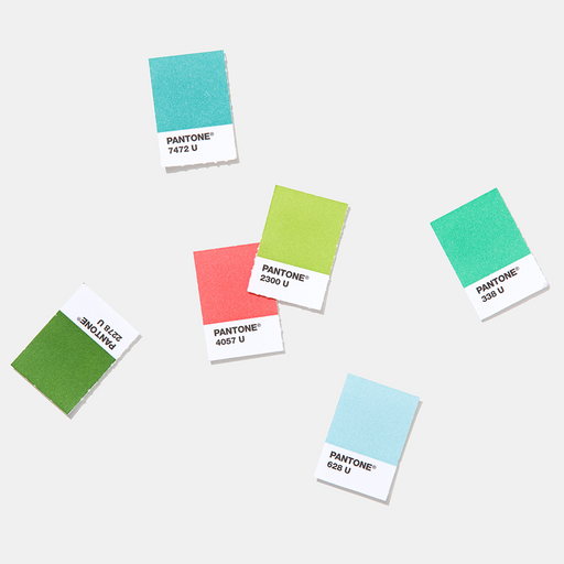
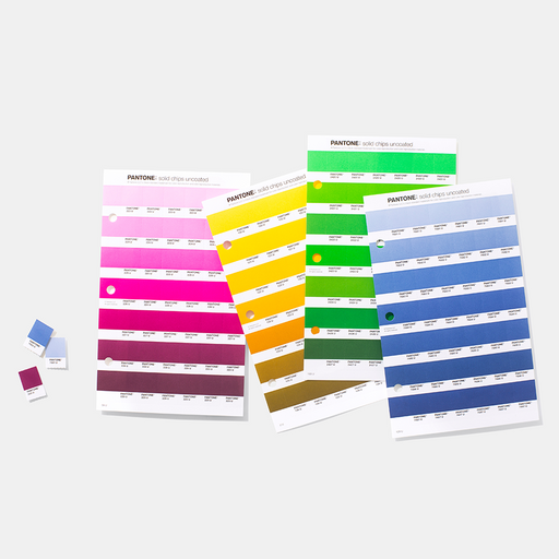
All PMS colours are also available as Plastic Chips, enabling consistent replication of your colours across your materials, Plastic Chips are large enough to be digitally measured and they also demonstrate multiple finishes and thickness.


PANTONE Connect is a new and powerful platform that lets designers access PANTONE Color Libraries, colour values, and navigation tools anywhere they work with colour.

Calibration tools allow you to view colour with confidence, on your screen, your projector, and your prints. We recommend you use Calibrite calibration tools.
Perforated colour chips let you work directly with your palettes, giving you greater confidence in your selections. We recommend that PANTONE Solid Chips or Sticker Chips of your desired colour always accompany artwork and design files, to show precise colour intent to strive for on-press.


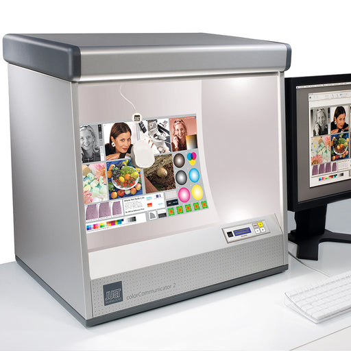
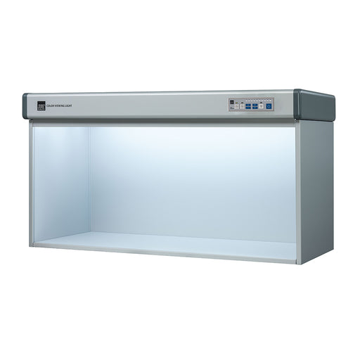
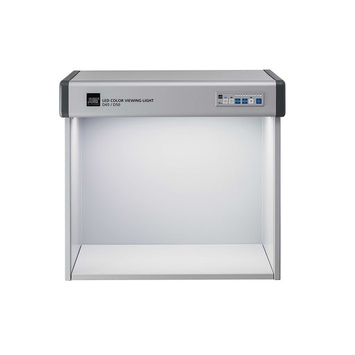
Lighting indicator stickers and viewing booths ensure you’re always evaluating under proper conditions.
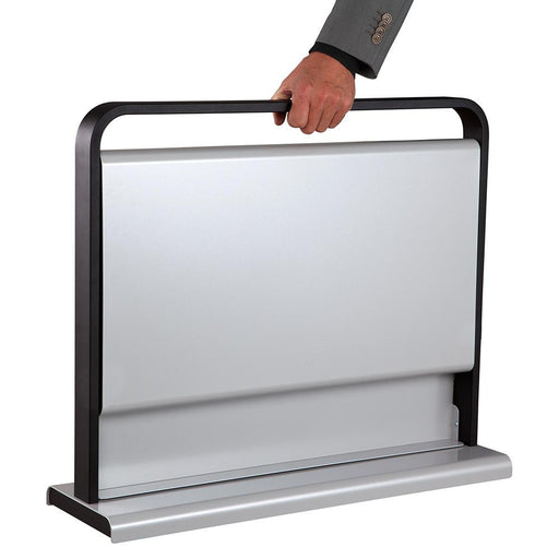
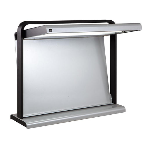
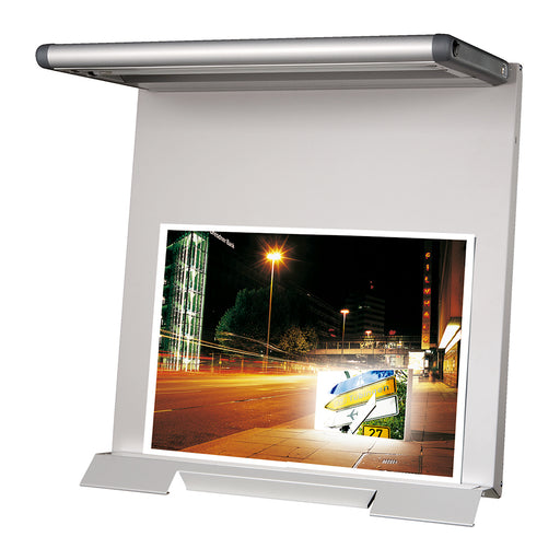
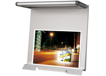
Just Normlicht LED colorFrame and colorFrame SPThis is a CtO product – Terms and Conditions ApplyThe LED colorFrame and colorFrame SP provide a con...
View full detailsJust Normlicht LED colorMaster SPThis is a CtO product – Terms and Conditions ApplyThe LED colorMaster SP offers desktop viewing of large prints. I...
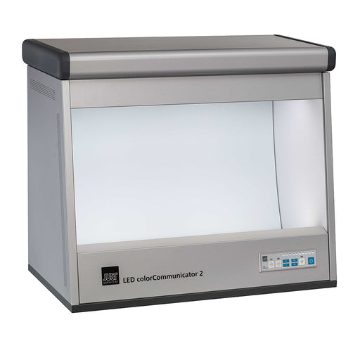
View full detailsJust Normlicht DLS (LED) colorCommunicator 2This is a CtO product – Terms and Conditions ApplyThe Just Normlicht LED colorCommunicator 2 is a conve...
View full detailsJust Normlicht DLS (LED) Color Viewing Light D65/D50/UV v7This is a CtO product – Terms and Conditions ApplyThe Just Normlicht LED Color Viewing Li...
View full detailsJust Normlicht DLS (LED) Color Viewing Light D65/D50/UV/LED-B1/LED-B3This is a CtO product – Terms and Conditions ApplyJust Normlicht LED Color Vie...
View full details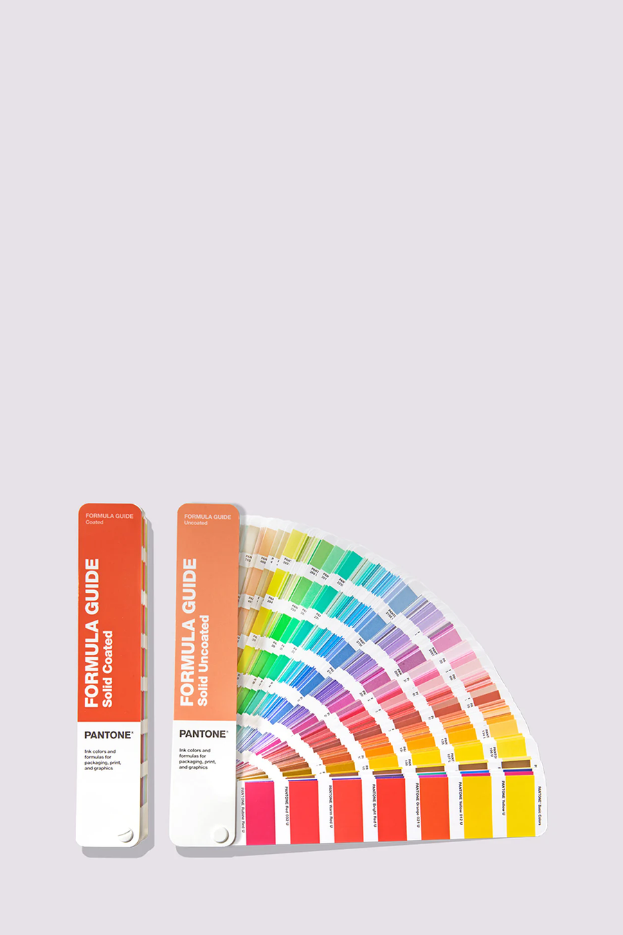
Colours: core, format: fan, values: spot
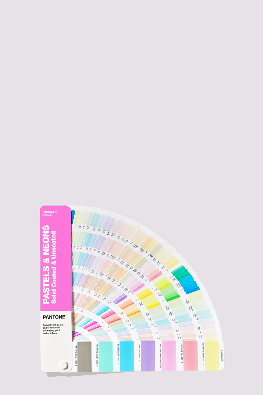
Colours: pastels & neons, format: fan, values: spot
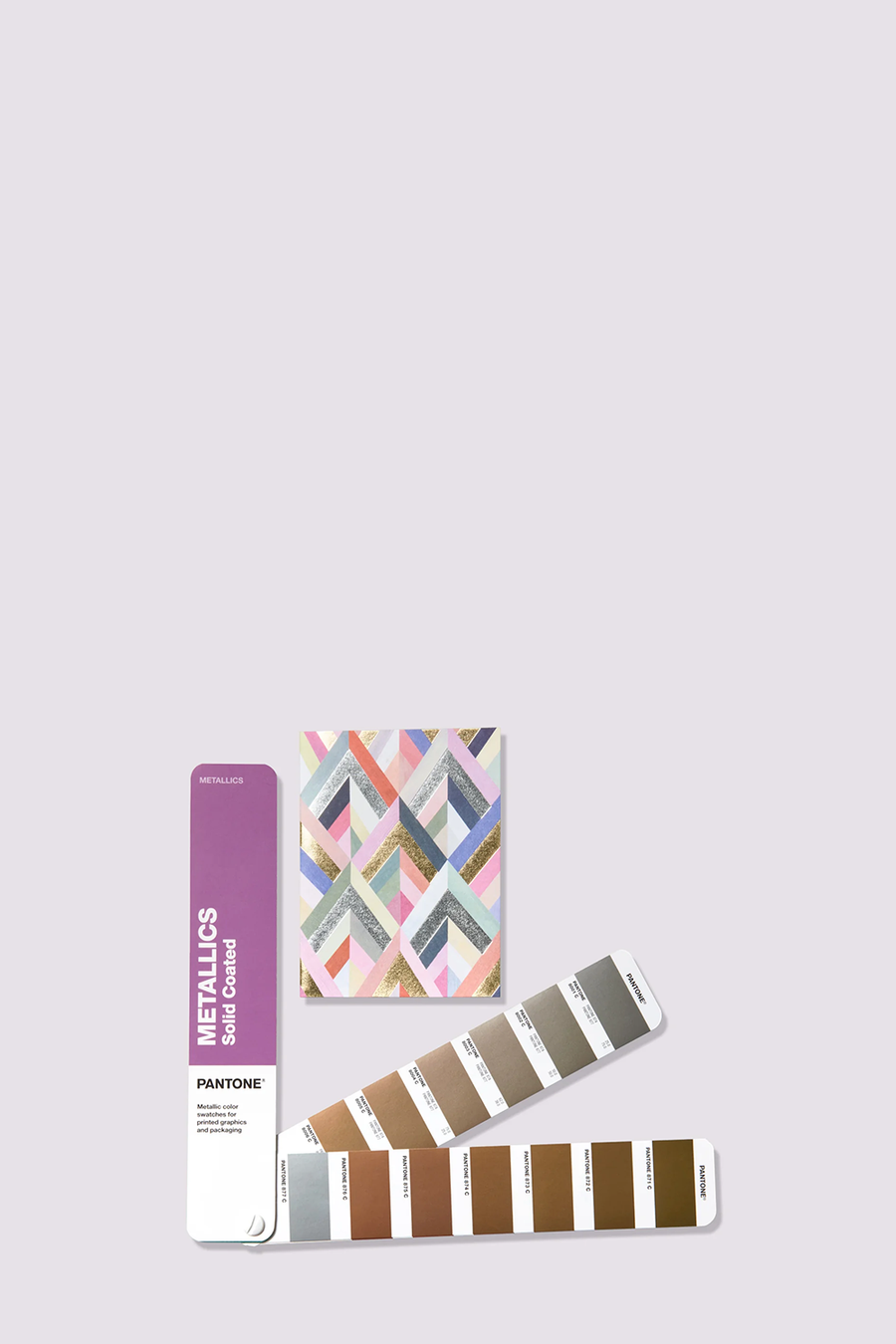
Colours: metallics, format: fan, values: spot
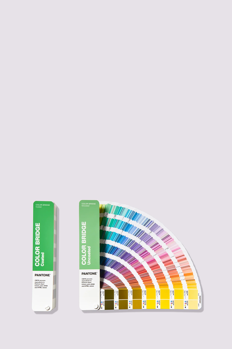
Colours: core, format: fan, values: spot & process
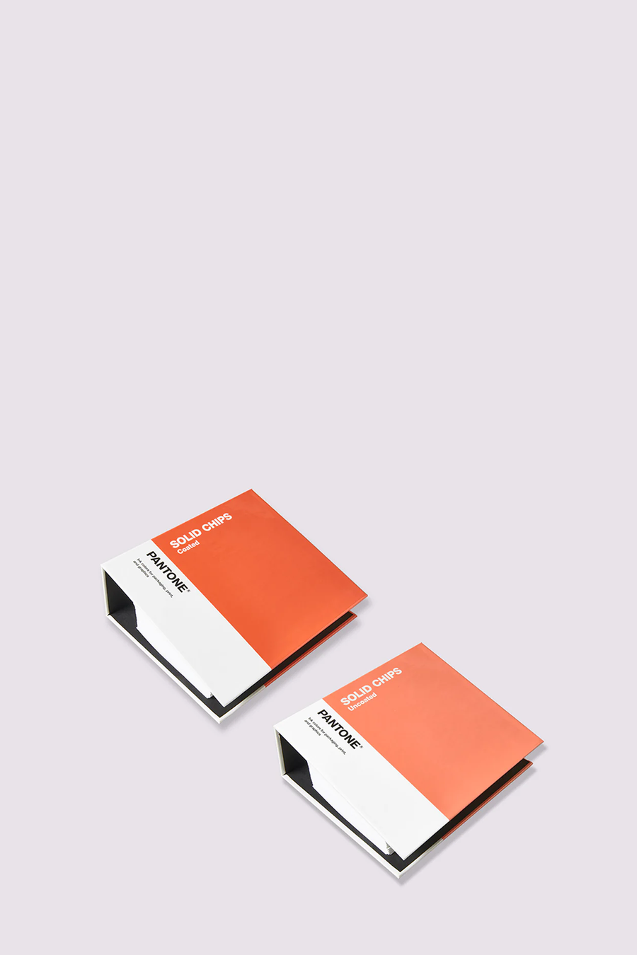
Colours: core, format: chips, values: spot
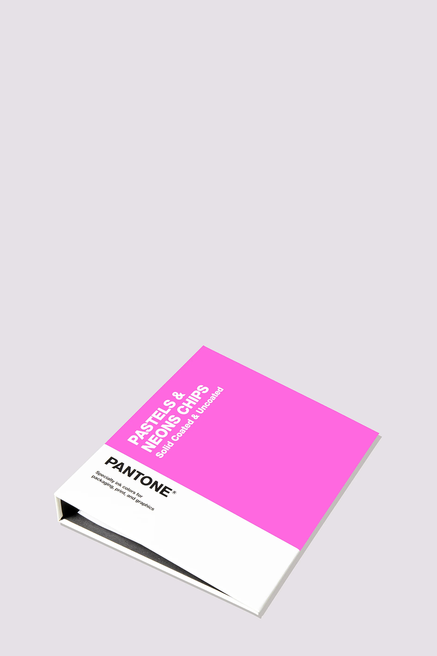
Colours: pastels & neons, format: chips, values: spot
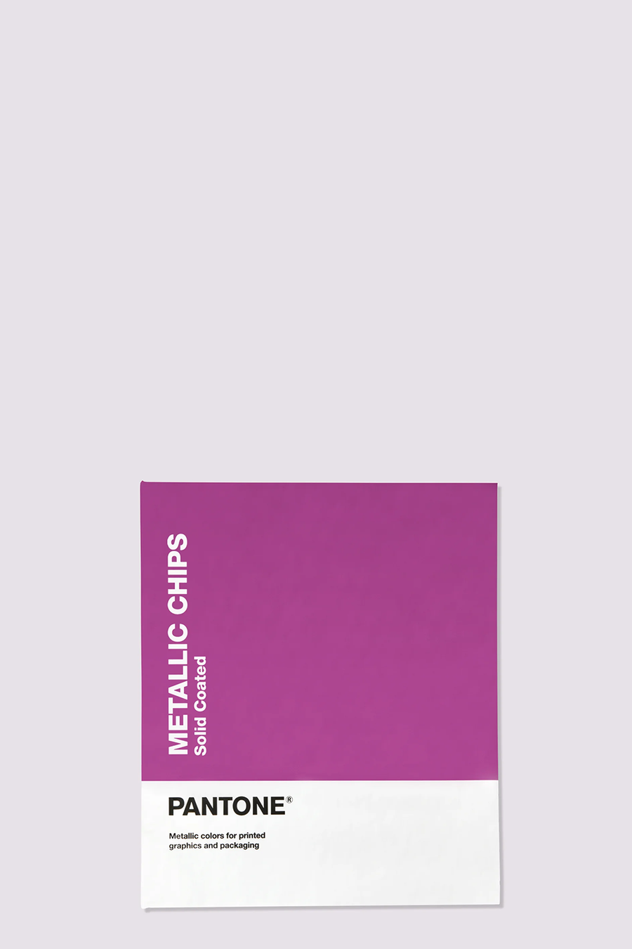
Colours: metallics, format: chips, values: spot
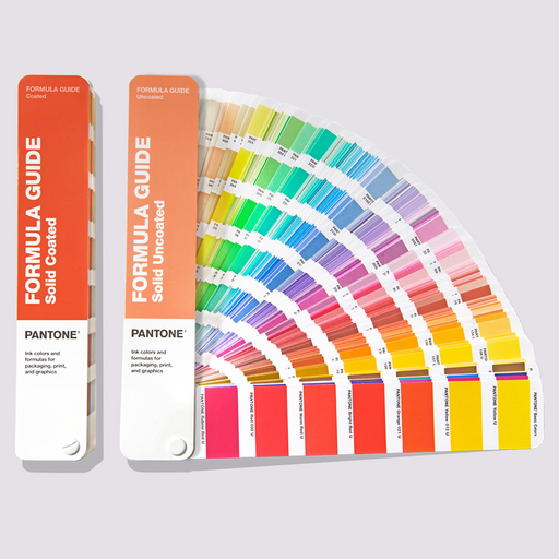
Pantone Formula Guide Coated and Uncoated Ultimate Colour Matching Tool to Communicate Colour in Graphics and Print Share, compar...
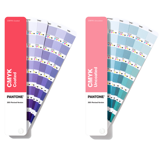
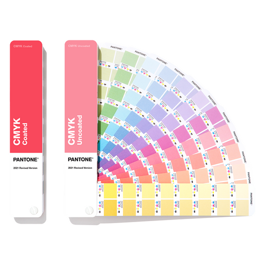
View full detailsPANTONE CMYK Guide Coated & Uncoated Be confident in your designs with the latest PANTONE CMYK Guide, full to the brim with 2,868 colours that...
View full detailsPantone® Color Bridge Guide CoatedSee the results of converting Pantone Spot Colors to an equivalent process colour with the Pantone Color Bridge G...
View full detailsPANTONE Chip Replacement Pages UncoatedThis is a CtO product – Terms and Conditions Apply Removable chips to refill your Pantone Graphics and ...
View full detailsPantone Color Bridge Guide Set Coated and Uncoated See the results of converting a Pantone Spot Color to its process colour equivalent with ...
View full details{"one"=>"Select 2 or 3 items to compare", "other"=>"{{ count }} of 3 items selected"}