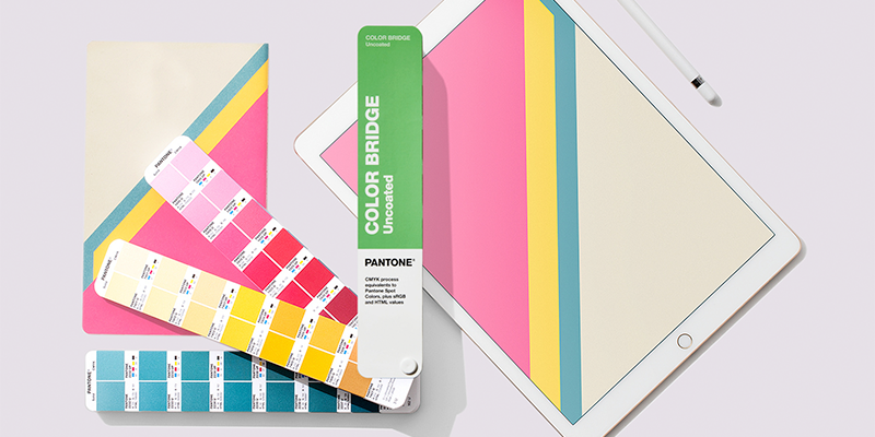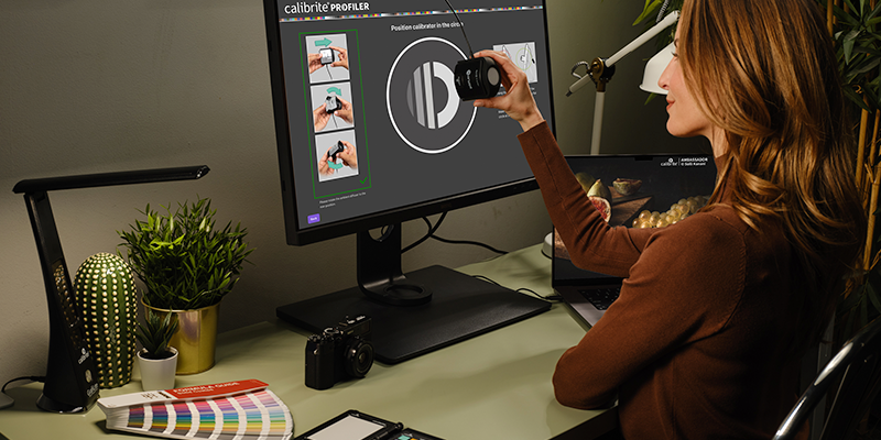

The hardest part is turning that idea into reality. As colour is one of the most important elements in product development today, making sure it is right is critical to the success of any product line. So, starting with the right tools will enable you to maintain the integrity of your creative vision, letting your dreams become a reality. If you’re working in print, packaging, or digital design, and aren’t sure which PANTONE Colour system you should be using, the PANTONE Graphics system is the one for you!
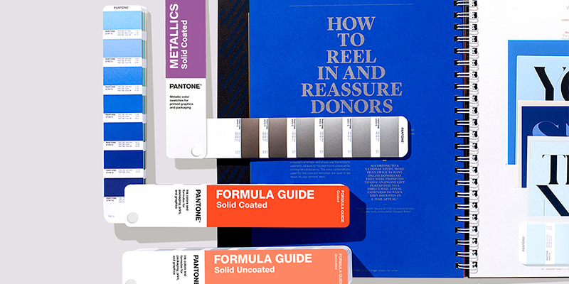
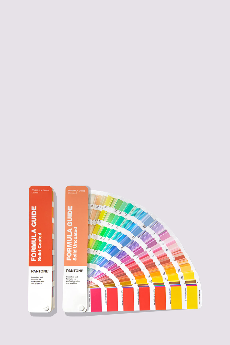
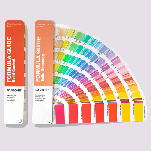
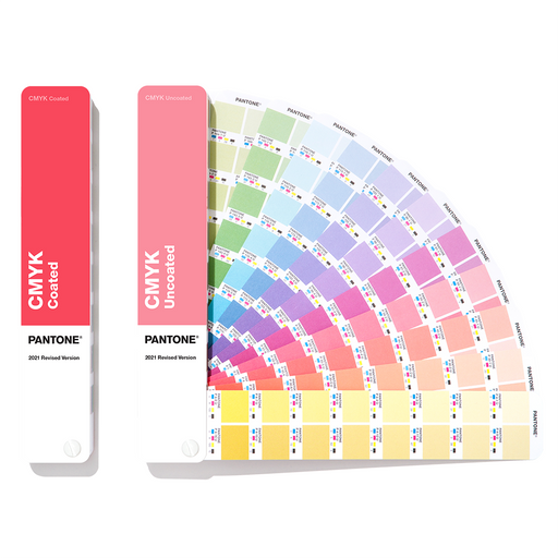
The heart of the PANTONE Matching System (PMS) is solid colour ink printed on paper. Why? Solid colours represent the truest representation of colour intent in graphic arts. Solid colour printing, also known as spot or offset, is the process by which a single colour is formulated and then applied through the printing process. The PANTONE Formula Guide is the only guide that includes ink formulations.