Skip to content
Black Friday Coming Soon - Sign up to our newsletter now to be the first to hear about our offers.

How to Read Your Colour References

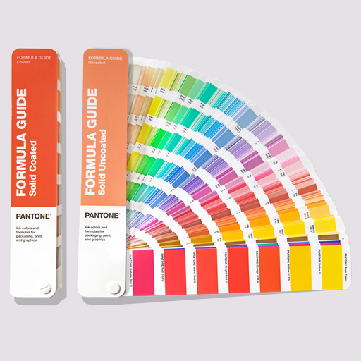
Fanned out PANTONE Formula Guide fan on a designer's desk, showing colour patches and ink mixing formulations beside colour chips and a pastel coloured inspiring notepad design.

PANTONE Formula Guide - for printers & ink manufacturers

The printing process traditionally uses four colours; cyan, magenta, yellow and black, which is called CMYK printing. Printing houses print with these four colours and a fifth PANTONE colour is added to allow for a wider range of colours to be produced.

To create this PANTONE colour to be used in printing, we need the ink formulation. The PANTONE Formula Guide is used by printers & ink manufacturers and contains all of the formulations to make these PANTONE colours.

Buy Formula Guide
A close up of the PANTONE Formula Guide showing colour swatches, their corresponding PANTONE codes and the solid ink colour formulations for printing.

How do I read my Formula Guide?

At the front of the Formula Guide, there are a series of basic PANTONE colours. All other colours within the guide are made up from formulations of these basic colours combined with a translucent medium.

Printed next to each colour is a standardised colour code - for example 2001 U. The first four digits are the standardised code for that particular colour, and the U or C shows whether the paper it is printed on is coated (C) or uncoated (U). If you know the colour identification number already, you can use the index to find the page number in the guide for that colour.

In addition to this there is a set of formulations printed next to the colour showing a ratio of each of the basic colours combined with a translucent medium. All of these values will add up to 100 so each value shows the percentage of the basic colour within the overall formulation.

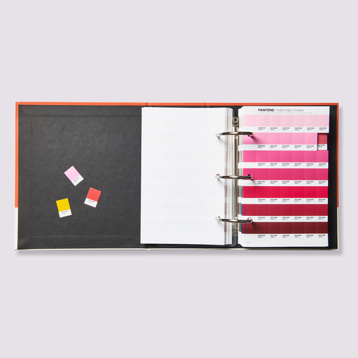
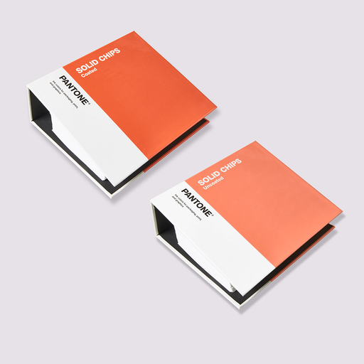
An image showing the PANTONE Solid Chips book open with removeable swatches torn out to be used in colour analysis for printed designs.

How can I communicate my chosen colour with the printers?

The Solid Chip Book contains the same colours as the Formula Guide, but displayed as removeable chips. These chips can be torn out and used as a communication tool and sent to others or used in mood boards. The Formula Guide, Solid Chips, Metallics & Pastels are all from the same colour system and are each available both as fan guides and removeable chip books. The books show the colour code but the Formula Guide must be used to obtain the ink formulation. For printing houses who regularly print with the same colours or have to formulate colours quickly, a Formula Scale is used which gives instant instructions on which basic colours to add when they are needed to make a formulation.

Buy Solid Chips
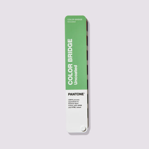
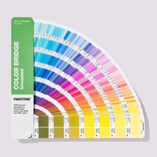
A close up of the PANTONE Color Bridge colour guide, showing colour swatches. The solid ink colour is displayed as a paper colour swatch next to its corresponding RGB colour code, next to the closest colour match in CMYK for printing.

How to read the PANTONE Color Bridge - for designers

Designers use the PANTONE Color Bridge to communicate colours with the printing house so that their designs match the printed product. Within the guide two versions of each colour swatch are shown. The first shows the solid ink colour (a smaller swatch of the one shown in the Formula Guide, although the formulation is not included here) and the second shows the closest colour match that can be made with the four colour CMYK printing process if the decision is made to just use standard CMYK printing. On some colours the difference is minor whereas for other colours there is a big visual difference between the original PANTONE ink formulation and the version using only CMYK colours. You can use the CMYK formulation (for example 0 49 84 0) included to share with the printing house so that they can produce the colour needed.

If designing digitally, each solid colour also shows its corresponding RGB values (red, green, blue) for setting when creating content in your chosen design software; for example: R 249 G 145 B 69. A HTML code, such as FA04BE is also included which can be used for web design. These exactly match the solid colour.

Buy Color Bridge
An image showing the PANTONE Matching System Plastic Standard Chips being used in a design environment, with each plastic chip having its own unique colour code. The collection can be used for colour selection and analysis for product design in the beauty, food & beverage, toy manufacture, medical and fashion industries.

PANTONE Plastics Range

The PANTONE Plastics products use the same colour system as the graphics range, for example 298C. C stands for Coated, showing that the colours are on a coated surface.

Browse range
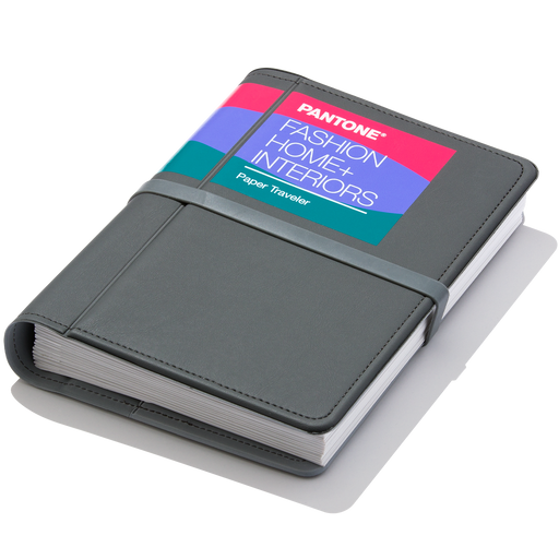
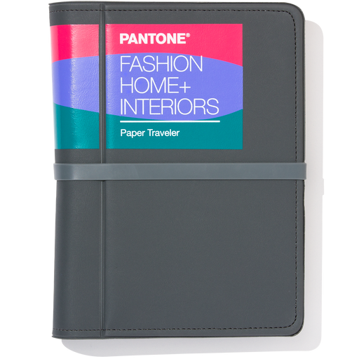
PANTONE Fashion, Home + Interiors Range

PANTONE Fashion, Home + Interiors Range

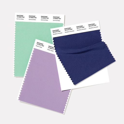
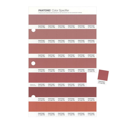
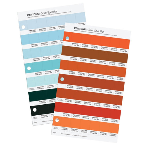
The Fashion, Home + Interiors range includes the PANTONE FHI guide and Specifier as well as the cotton, polyester and nylon ranges printed on the corresponding fabric type.

All products within the Fashion, Home + Interiors range use a six-digit code to define the colour number and a suffix (TCX, TPG, TPM for example) which describes the material printed on. Within the six-digit code 11-0700 TPG, the first two digits define the lightness level of the colour (between 11 and 19). The second pair of digits specify the hue. There are 65 different hues in total, including 00 representing the neutral point. The third pair of numbers represent the chroma level of the colour, with 65 chroma steps starting with 00 neutral.

PANTONE Fashion, Home & Interiors Code Suffixes

Where the same colour appears across different FHI products, it will show the same six-digit code, with only the suffix changing dependant on the material. The choice of guide will depend on the type of material you are designing for and the size of swatch that you need to reference, whether that’s for cosmetics, fashion, product design or home furnishings.

TPX = Textile Paper, indicating that the colour reference is printed on paper. This has been replaced by TPG when PANTONE updated their ink formulations to a more eco-friendly alternative.

TPG = Textile Paper Green, indicating that the colour reference is printed on paper with an environmentally friendly ink formulation. The FHI Color Guide & Specifier use this suffix.

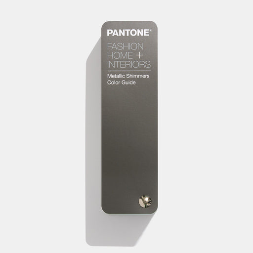
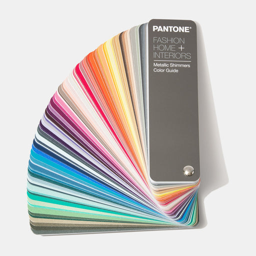
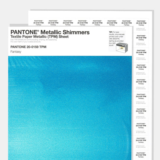
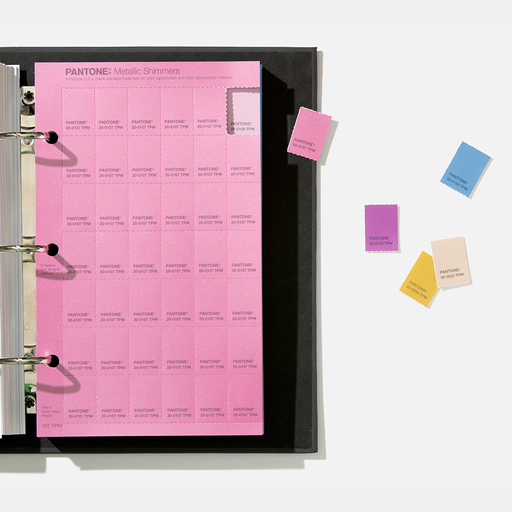
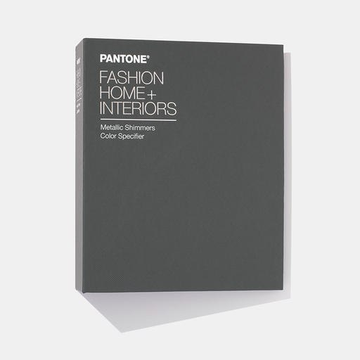
TPM = Textile Paper Metallic, indicating that the metallic colour reference is printed on paper. This is used for FHI Metallic Shimmers Guide and Specifier.

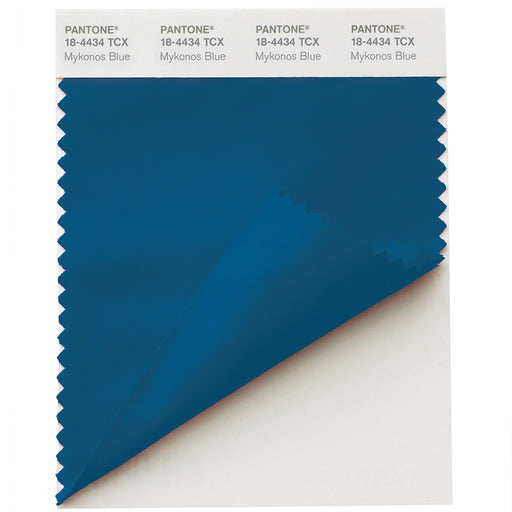
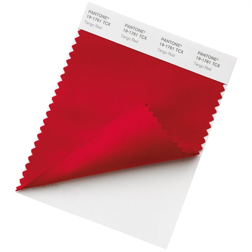
TCX = Textile Cotton Extended, indicating that the colour reference is printed on cotton. This suffix is used for the entire PANTONE FHI Cotton range, including the Cotton Passport, Planner, Chip Set and Swatch Library, which all show the same colours in differing swatch sizes.

TSX = Textile Synthetic Extended, indicating that the colour reference is printed on polyester, as with the Polyester Swatch Card.

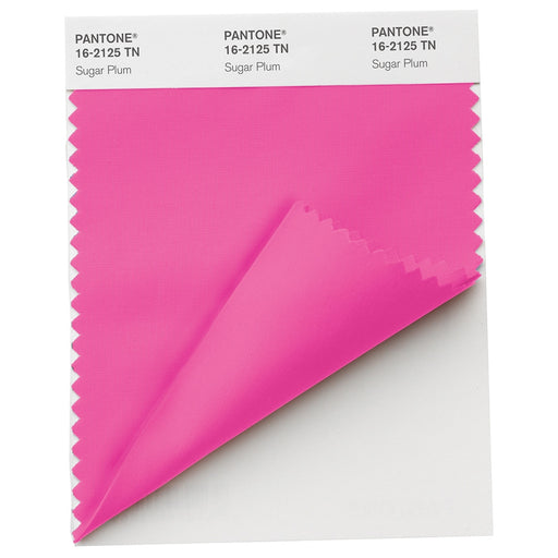
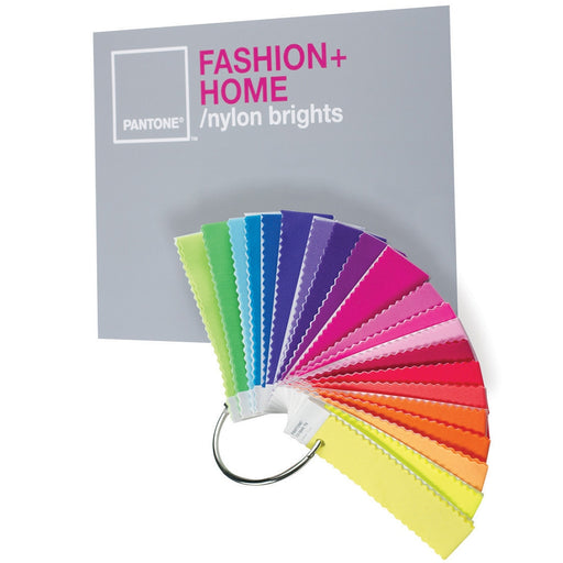
TN = Textiles Nylon, showing the colour references printed on nylon, as with the FHI Nylon Brights Set.

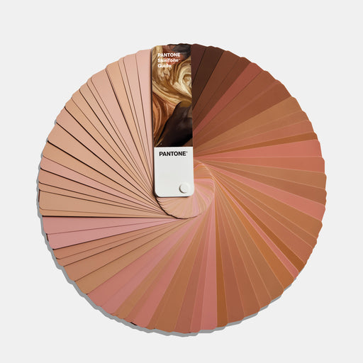
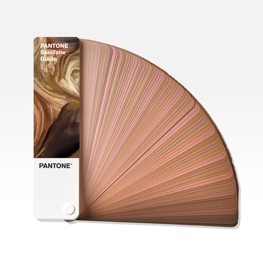
The PANTONE SkinTone Guide, showing the full range of human skin tones to reference, for games design, toy manufacture, prosthetics, cosmetics design and more.

PANTONE SkinTone Guide

The PANTONE SkinTone Guide has a separate numbering system. Each four-digit number is comprised of two digits reflecting the hue and undertone of the skin followed by a second set of digits representing the tone, lightness & darkness of the skin from fair to dark, for example 1Y09 SP. The guide is primarily used within the fashion and beauty industry and within digital gaming and video to ensure realistic and diverse skin tones are accurately produced on screen.

Buy SkinTone Guide
More Learning Topics

Visit our learning centre for decades of experience in all things colour management.
Which RAL Colour Guide do I need?

Learn about the RAL Classic, RAL Effect and RAL Design System Plus ranges and which guides are suitable for which industrial and business applications in architecture, design and manufacturing.
Learn About NCS - Universal Colour Communication

Learn why a colour system is necessary, which NCS tool you need to communicate colours, and walk through the different product options and their applications in DIY, home decor and interior design.

Color Confidence Blog

Check out more topics and stay up to date with the latest news.

Compare products

{"one"=>"Select 2 or 3 items to compare", "other"=>"{{ count }} of 3 items selected"}

Select first item to compare

Select second item to compare

Select third item to compare

Compare