0800 977 4167
0800 977 4167

The start of 2020 saw the typical new year’s resolutions; get fit, Dry January, reduce screen time; and whilst some new year’s resolutions have been known to stick, we’re looking to focus on achievable resolutions that will provide significant benefits in our everyday life.
Colour management can sometimes be overlooked, but should be considered from the outset before you even capture your image for the result to match your vision. We’ve rounded up our top 5 colour management habits to adopt in 2020, helping you perfect your images and save time and money.
White balance is how warm or cool the overall colours in your image look, therefore if your white balance hasn’t been set, this can cause your image to appear too warm or too cool. We recommend setting a custom white balance before shooting to save time looking for a neutral reference point later in post-production and to ensure that the colour temperature of your image has been adjusted according to the shooting location.

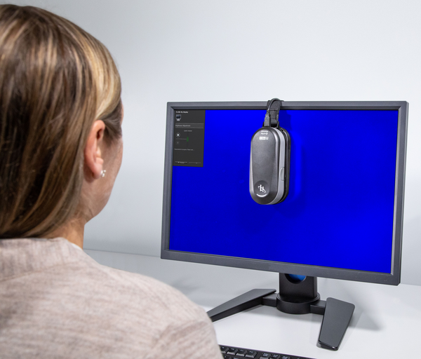
Calibrating your monitor is one of the fundamental aspects of colour management. If you reach the photo editing stage and your monitor isn’t displaying accurate colours, there will be very little chance of producing an image with the colours you captured! We recommend calibrating your monitor every 2-6 weeks since temperature and screen brightness will gradually change over time. Monitor calibration tools we love include X-Rite i1Display Studio, X-Rite i1Studio and X-Rite i1 ColorChecker Photo Kit.

You’ve already bought the right tools for your colour management workflow, so the next step is to use industry-standard software, such as Adobe, Capture One and Affinity. Adobe Photoshop is perfect for retouching, compositing and editing images down to the pixel level. Capture One’s Phase One software gives professional photographers the tools they need to produce premier quality images direct from RAW files. Affinity Photo offers sophisticated tools for enhancing and retouching your images in an incredibly intuitive interface. It’s just about finding the best software that suits your needs!
Whether you’re working from a studio or at home, it is essential to work in a correctly lit space to avoid viewing your prints in exceptionally dark or bright conditions. If possible, set up a viewing area with a viewing booth, which is designed for evaluating work where there is often a lack of natural light. If a viewing booth is out of your budget, consider assessing prints by using a natural daylight lamp, such as the GrafiLite, which allows you to view prints and colour swatches in natural light during any time of the day.

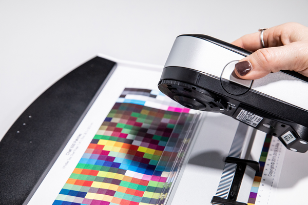
When it comes to colour management, it’s important to have the right tools to achieve the best results. Whether you have a small or large budget, it’s important to get into the habit of choosing the best tools for your budget and need, and there are a variety of tools available to help you achieve those perfect results. X-Rite’s calibration tools are designed for anyone serious about colour management for their images, with a range of tools for photographers and digital imaging experts who are looking to achieve consistent colours from capture-to-screen-to-print.
Want to get into these habits? Then we’ve got all of the right tools for you here.
Calibrite ColorChecker Studio Unleash your colours with Calibrite Professional Capture to Print Calibration The Calibrite ColorChecker S...
View full detailsCalibrite Video Photo Kit Expert Camera reference and monitor calibration you can trust for accurate results from capture through edit and grading...
View full detailsCalibrite Photo Kit Start with optimized color at capture and finish strong through editing Expert software with built-in presets and fully cust...
View full detailsCalibrite Creator Kit Easy to use tools you need to set your work apart Easy to use Software At video capture: Set white point, Set exposure, Ma...
View full detailsCalibrite Display 123 Colour correct your monitor… Easy as 1-2-3. Get and keep your monitor colour right for editing, gaming and any time colour-...
View full detailsColorChecker Passport Video 2 Colour Control for Photo & Video from Capture to Edit ColorChecker Passport Video 2 is ideal for videographers ...
View full detailsCalibrite Display Plus HL Precision calibration for demanding creatives with the latest display technology The only calibra...
View full detailsCalibrite Display Pro HL Professional calibration for demanding creatives The new standard in calibration devices capable o...
View full detailsCalibrite ColorChecker Classic XL with Case ColorChecker Classic XL This is a larger version of the ColorChecker Classic f...
View full detailsCalibrite ColorChecker Folio CaseThis rugged, dark grey portable case for the ColorChecker targets provides the ultimate durability and protection ...
View full detailsCalibrite ColorChecker Target HolderMulti-size Target Holder This compact, sturdy, multi-size target holder is for any target sized 60 – 275mm. It ...
View full detailsCalibrite ColorChecker Video XL with Case ColorChecker Video XL The Calibrite ColorChecker Video XL provides an extra-large format for effortle...
View full detailsCalibrite ColorChecker Video XL Video Color Control from Capture to Edit The Calibrite ColorChecker Video XL provides an extra-large format for e...
View full detailsCalibrite ColorChecker Video Mega Video Color Control from Capture to Edit This is a CtO product – Terms and Conditions Apply The ColorChecker Vide...
View full detailsCalibrite ColorChecker VideoVideo Color Control from Capture to EditThe ColorChecker Video offers colour balance and control for filmmaking – from ...
View full detailsCalibrite ColorChecker Gray BalanceExposure 18% Gray Balance for Photo and Video from Capture to EditThe ColorChecker Gray Balance is the largest s...
View full detailsCalibrite ColorChecker Gray Balance MiniExposure 18% Gray Balance for Photo and Video from Capture to EditThe ColorChecker Gray Balance Mini is the...
View full detailsCalibrite ColorChecker 3-Step Grayscale3-Step Exposure and White Balance Control for Photo and Video from Capture to EditSimplify camera and studio...
View full detailsCalibrite ColorChecker White BalanceWhite Balance Control for Photo and Video from Capture to EditThe ColorChecker White Balance target is spectral...
View full detailsCalibrite ColorChecker XL Case This rugged, dark grey portable case for the ColorChecker XL provides the ultimate durability and protection for yo...
View full detailsCalibrite ColorChecker Classic Mega Photo Color Control from Capture to Edit This is a CtO product – Terms and Conditions Apply The ColorChecker Cl...
View full detailsCalibrite ColorChecker Digital SG Semi-gloss Camera and Scanner Reference Target for Calibration and ICC Profiles Obtain the widest colour gamut ...
View full detailsCalibrite ColorChecker Classic XL Photo Color Control from Capture to Edit This is a larger version of the ColorChecker Classic for those shots t...
View full detailsCalibrite ColorChecker ClassicThe Original ColorChecker for Color Control from Capture to EditThe ColorChecker Classic target is designed to delive...
View full detailsCalibrite ColorChecker Passport Photo 2 Colour Control for Photo from Capture to Edit ColorChecker Passport Photo 2 offers precise and consistent...
View full details
Pantone has revealed its much-anticipated Color of the Year for 2026, and this time the spotlight falls on PANTONE 11-4201 Cloud Dancer — a soft, airy white that embodies calm, clarity and the power of a fresh start. In a...

You’ve all heard of Pantone, and unless you’ve been living in an alternate designer universe, you’ve heard of the Pantone Formula Guide. But what about the Pantone Color Bridge? Whether you're getting started as a designer, managing a brand, directing...

Introduction Founded in 1925, the Reichsausschuss für Lieferbedingungen's (shortly described as RAL) aim was to standardise the colours in which industrial goods were coated, varnished and coloured. The first RAL colour chart initially contained a selection of 40 standardised shades,...
{"one"=>"Select 2 or 3 items to compare", "other"=>"{{ count }} of 3 items selected"}