Colour has always played a central role in architecture. Long before digital rendering, architects relied on pigments, materials and craftsmanship to define mood, hierarchy and meaning. Understanding historic architectural colour palettes is not just an academic exercise; it remains highly relevant for today’s architects, conservation specialists, designers and manufacturers working on restoration, heritage projects or contemporary reinterpretations.
From the restrained earth tones of Romanesque architecture to the expressive hues of Art Nouveau, historic colour use continues to influence modern specification. Accurate colour reference tools and calibrated displays are essential when translating this heritage into today’s workflows.
Romanesque Architecture: Earth, Stone and Pigment
 Romanesque architecture (c. 10th–12th century) is characterised by thick walls, rounded arches and a sense of solidity. Colour palettes were typically muted and mineral-based, reflecting both available materials and symbolic restraint.
Common Romanesque colours included:
- Stone greys and warm beiges
- Ochres and umbers
- Deep iron reds and charcoal blacks
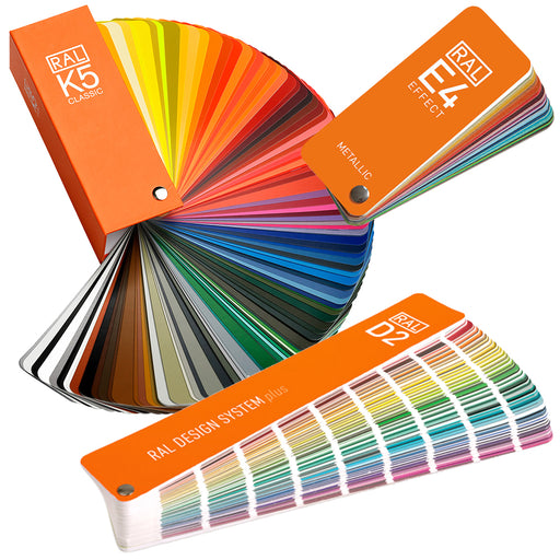
Where paint was used internally, it was often derived from natural pigments and applied sparingly. Today, these tones align closely with RAL Classic and NCS Earth and Neutral ranges, making them useful references when specifying finishes for heritage-inspired projects.
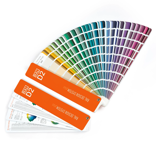
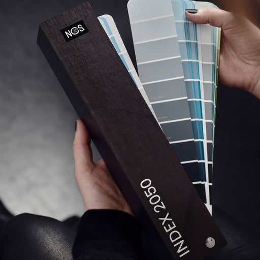
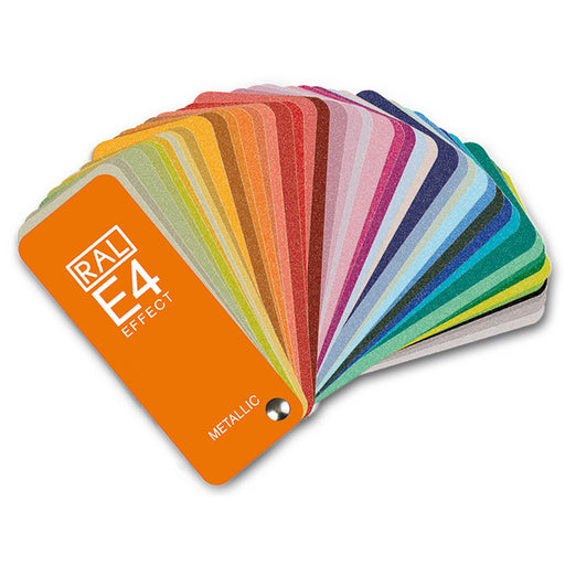
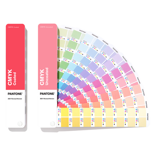
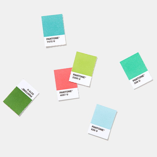
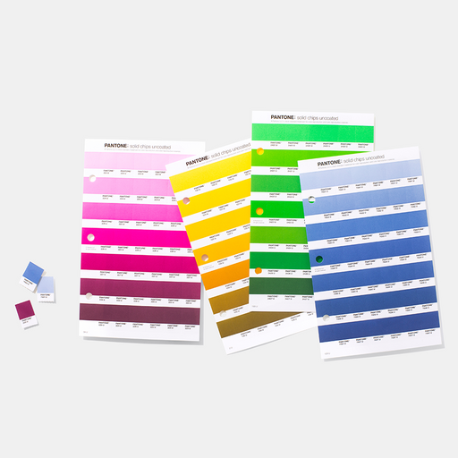
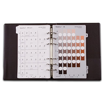
Using physical colour guides such as RAL or NCS allows designers to move beyond subjective descriptions like “warm stone” and specify colours consistently across materials and suppliers.
Gothic Architecture: Light, Contrast and Symbolism
 As architecture evolved into the Gothic period (12th–16th century), colour became more expressive. Advances in construction allowed for taller buildings, larger windows and stained glass, dramatically changing how colour interacted with light.
Typical Gothic colour palettes featured:
- Deep blues and ruby reds
- Gold accents and strong contrasts
- Painted stone and decorative detailing
Stained glass windows introduced highly saturated colours that shifted throughout the day. Recreating or referencing these effects in modern projects requires careful colour evaluation under controlled lighting conditions. This is something that calibrated displays such as EIZO ColorEdge monitors excel at.
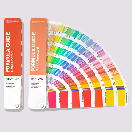
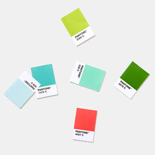
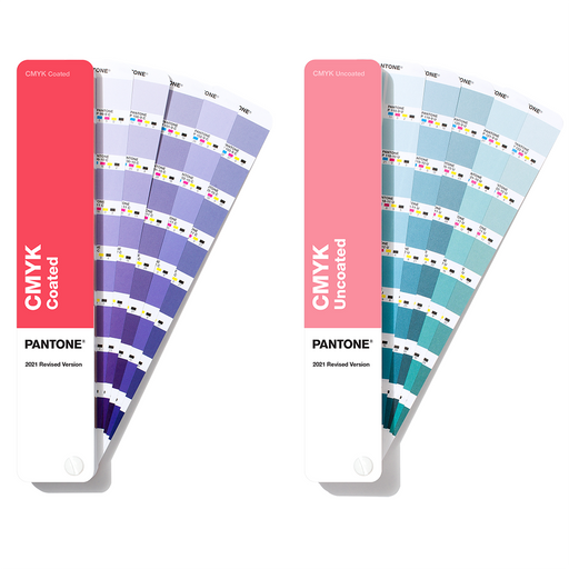
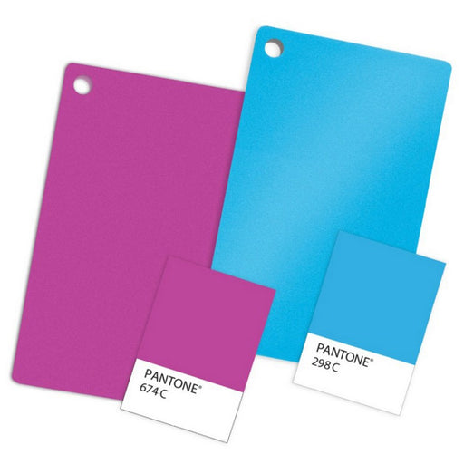
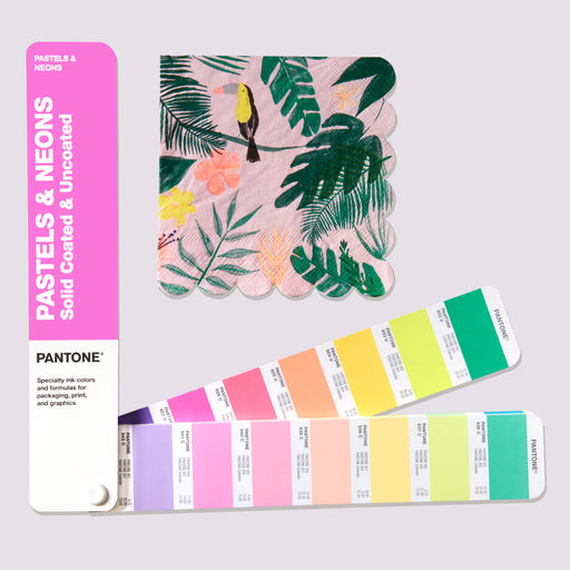
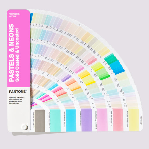
For contemporary designers interpreting Gothic colour schemes, PANTONE references are often useful when matching richly saturated colours for print, glass or decorative elements.
Renaissance Architecture: Balance, Harmony and Natural Colour
 Renaissance architecture marked a return to classical principles, proportion and harmony. Colour palettes became more restrained and balanced, often inspired by nature and classical antiquity.
Typical Renaissance colours included:
- Soft terracottas and warm stone tones
- Muted greens and blues
- Creams and off-whites
These palettes translate well into modern architectural colour systems. NCS is particularly valuable here, as its perceptual model helps designers understand subtle shifts in hue, blackness and chromaticness. This is critical when working with understated, material-led colours.
For accurate visualisation, colour-accurate monitors such as EIZO professional displays help ensure these subtle tones are assessed correctly on screen before specification.
Baroque and Rococo: Drama, Luxury and Ornament
 Baroque (17th century) and Rococo (18th century) architecture embraced drama and opulence. Colour became a tool for emotional impact and visual hierarchy.
Common colours included:
- Rich golds and creams
- Deep blues, greens and burgundies
- Pastels in Rococo interiors
These palettes often combined strong colour with elaborate surface finishes. When translating these schemes into modern materials for paint, print or textiles, consistent colour reference is critical.
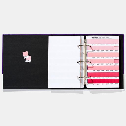
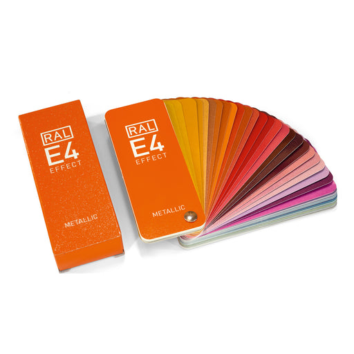
PANTONE colour guides are frequently used here to bridge creative intent and production, while RAL remains essential for architectural coatings and finishes.
Victorian Architecture: Eclecticism and Industrial Colour
 Victorian architecture coincided with industrialisation, bringing new pigments, mass production and an explosion of colour choice. This period embraced eclectic, sometimes bold colour combinations, both externally and internally.
Victorian palettes often featured:
- Deep greens, oxblood reds and navy blues
- Contrasting trims and decorative highlights
- Painted brickwork and polychromatic facades
Modern designers revisiting Victorian colour schemes benefit from structured systems like RAL Design or NCS, which allow complex colour relationships to be defined clearly and reproduced reliably.
Accurate on-screen colour evaluation is particularly important when dealing with historically bold colours, where small shifts can dramatically alter perception.
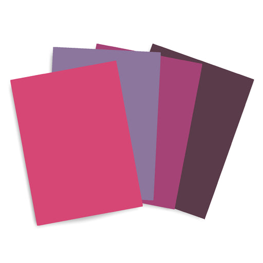
Art Nouveau: Nature, Flow and Expressive Colour
 Art Nouveau (late 19th–early 20th century) broke away from historic imitation, drawing inspiration from nature, movement and organic forms. Colour palettes became more expressive and fluid.
Typical Art Nouveau colours included:
- Olive greens, teals and soft blues
- Muted purples and warm neutrals
- Decorative, flowing colour transitions
These palettes can be challenging to reproduce accurately due to their subtle tonal relationships. Using physical colour guides alongside calibrated monitors ensures that what is approved on screen aligns with real-world output.
For studios working across digital, print and architectural surfaces, combining PANTONE or NCS colour guides with a colour accurate monitor creates a reliable colour workflow.
Why Historic Colour Still Matters Today
Historic architectural colour palettes continue to influence:
- Conservation and restoration projects
- Contemporary reinterpretations of classic styles
- Product design, finishes and surface specification
Relying on memory, images or uncalibrated screens introduces risk. Physical colour standards such as , and provide a common language across disciplines, while colour-accurate monitors ensure confidence at the design and approval stage.
Building Colour Confidence Across Disciplines
Whether you are specifying coatings, developing visualisations, producing print materials or presenting concepts to clients, colour accuracy underpins credibility.
Understanding where colour comes from, historically and technically, is the foundation of confident design.