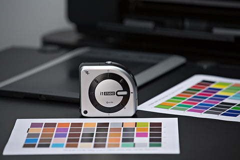
Colour management is an incredibly important concept within photography, yet it is a subject that can cause the greatest amount of confusion, even amongst the most experienced photographers.
Nevertheless, there’s an extensive range of colour management solutions in the market to help avoid this confusion, and this is where the X Rite i1Studio comes in.
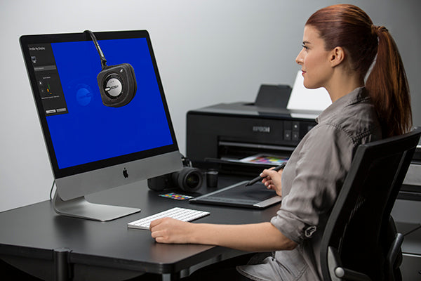
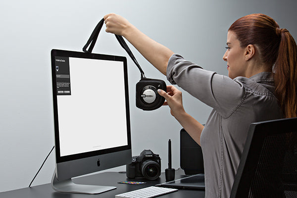
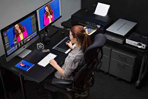
The i1Studio colour calibration tool is the professional level, start-to-finish colour management solution, created for photographers who regularly shoot, scan, edit and print, but who don’t have limitless time to spend on the process.
X-Rite’s latest release surpasses various other colour management products in the market with its unique features, including:
NEW i1Studio software for displays, projectors, scanners and printers: The i1Studio software, based on X-Rite’s award-winning i1Profiler software, provides an easy to navigate interface that delivers expertly calibrated and profiled monitors, projectors, scanners and printers, including a new dedicated black and white print module
ColorChecker Camera Calibration for Cameras: The included industry-standard 24 patch target allows creatives to create custom camera profiles, set a custom white balance and have a neutral starting point no matter what light photographers are shooting in – making sure you’re capturing true colours from the start
ColorTRUE Mobile App for iOS Devices: A simple way to calibrate Apple® iOS mobile devices for a true mobile to desktop colour match of all images
But how does this benefit creative professionals and those working in the print industry?
Colour calibration is essential in achieving accurate colours in photos and prints; therefore a tool that provides this for your camera, monitors and printers all in one can save professionals a great deal of time and money during the editing process.
With a tool that is this simple to use and is so travel-friendly, you have perfectly calibrated photos at your fingertips!
One of the key features of the i1Studio is the software included with the device; the ColorChecker Camera Calibration software.
This software can work with your raw editing software to create a colour profile for each camera you use and allows you to profile camera/lens combinations.
Camera calibration profiles save a great deal of time in post-processing and in situations where the lighting was cooler or warmer than you’d like, or if there was colour contrast from other elements in the shot.
Don’t just take our word for it; FStoppers described the i1Studio as “a true workhorse, hitting all the marks where colour calibration is concerned.
If you’ve been putting off investing in a calibration tool because you are intimidated by the process, or the tools you’ve seen don’t have the options you’re looking for, the i1Studio is the tool for you.” Read the full review here.
If you are considering investing in a device that enables you to calibrate your entire workflow from capture to print, then the i1Studio is the ideal device!
Colour communicates before a customer reads a word. It can make a brand feel established, energetic, approachable or exclusive. It can help a new business look credible, distinguish one product from another and make an identity easier to recognise. This...
Fresh pinks, vivid yellow-greens and deep purples bring plenty to explore in PANTONE’s latest graphics colour release. With 224 new colours joining the PANTONE Matching System, designers have more possibilities for building a brand identity, developing packaging or finding the...
Choosing a colour is rarely as simple as choosing a shade. A soft green may look calm and balanced on a screen, richer on coated paper, flatter on fabric and cooler on metal. The colour itself may be similar, but...